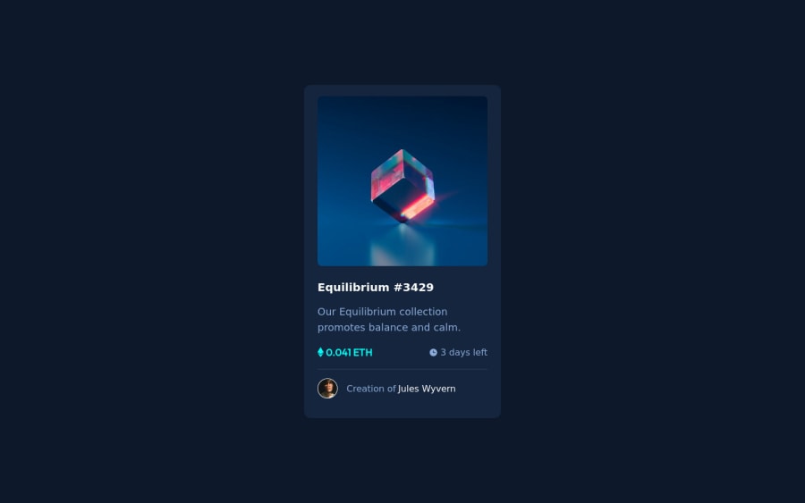
Design comparison
SolutionDesign
Community feedback
- @denieldenPosted about 2 years ago
Hello Muhriz, You have done a good work! 😁
Some little tips to improve your code:
- use
maintag to wrap the card and improve the Accessibility but not as a container of that one element - also you can use
article or divtag instead ofmainto the container card for improve the Accessibility - You can add the effect
:hovercreating adivthat appears on hover. I used tailwind but you can still see and understand which css properties you can use to do the same. Look here -> my solution - to make it look as close to the design as possible add
width: 22remto the card container - use
min-height: 100vhto body instead ofheight, otherwise the content is cut off when the browser height is less than the content
Keep learning how to code with your amazing solutions to challenges.
Hope this help 😉 and Happy coding!
0@muhrizmrzPosted about 2 years ago@denielden use min-height: 100vh to body instead of height, otherwise the content is cut off when the browser height is less than the content. This point I don't understand
1@denieldenPosted about 2 years ago@muhrizmrz if you use
height: 100vhyou tell the browser that the height of your page is equal to the screen and no more, so in smaller screens where the design goes out of the screen size the content is cut off and you can't see it allMarked as helpful0 - use
Please log in to post a comment
Log in with GitHubJoin our Discord community
Join thousands of Frontend Mentor community members taking the challenges, sharing resources, helping each other, and chatting about all things front-end!
Join our Discord
