NFT-Preview-Card-Component

Solution retrospective
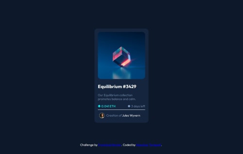
I'm most proud of successfully implementing the hover effect on the NFT Card Component. It required careful attention to CSS details to achieve the desired visual effect, particularly the overlay and the view icon appearing on hover. Next time, I would spend more time planning out the hover state behavior before diving into coding. This way, I could better anticipate potential issues and plan a more efficient solution.
What challenges did you encounter, and how did you overcome them?One of the main challenges was handling the hover effect on the NFT Card Component. Specifically, getting the view icon to appear correctly over the image and ensuring the light blue overlay covered the entire image took some time to figure out. I overcame this by experimenting with different CSS properties like position, z-index, and opacity. I also consulted online resources and community forums for tips on managing hover states effectively.
What specific areas of your project would you like help with?I would appreciate feedback on optimizing the CSS for the hover effect. While I managed to achieve the desired outcome, I'm not sure if my approach is the most efficient or maintainable. Any suggestions on improving the CSS structure, reducing code redundancy, or using best practices for hover states would be greatly appreciated. Additionally, I'd like advice on making the hover transition smoother to enhance the user experience.
Please log in to post a comment
Log in with GitHubCommunity feedback
No feedback yet. Be the first to give feedback on TURLAPATI MANOHAR's solution.
Join our Discord community
Join thousands of Frontend Mentor community members taking the challenges, sharing resources, helping each other, and chatting about all things front-end!
Join our Discord