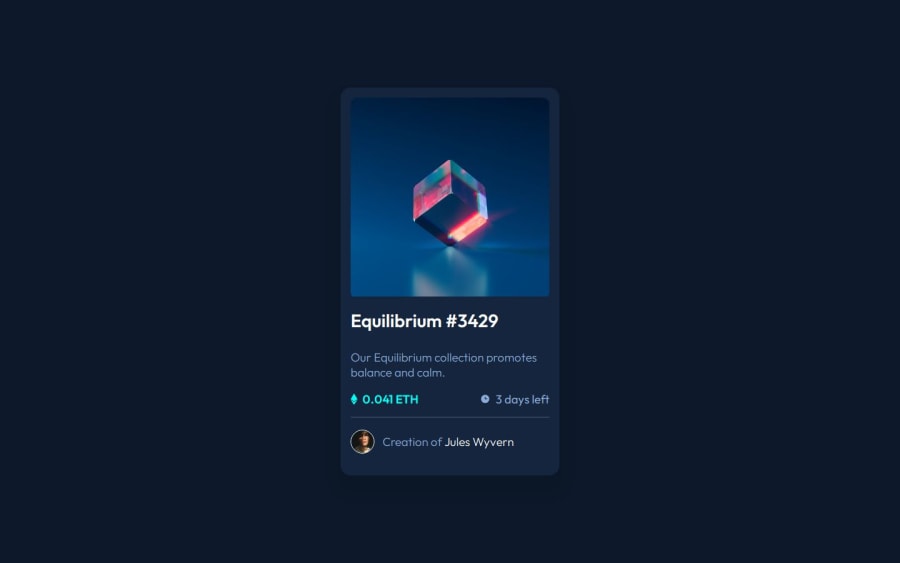
Design comparison
Community feedback
- @pstar8Posted 5 months ago
Hi Emma, nice work you got there.
I couldn't help but notice your card image and other elements like the "Equilibrium" and the name "Jules Wyvern" don't have hover states.
To give them hover states, you could try this ;
.name:hover{ color: hsl(178, 100%, 50%); cursor: pointer; }
.equilibrium:hover{ color: hsl(178, 100%, 50%); cursor: pointer; }.
Every other thing looks great. Keep up the good work.
0@emmadumbiPosted 5 months ago@pstar8 thanks for the helpful review, I’ll try it out 👍🏼
0
Please log in to post a comment
Log in with GitHubJoin our Discord community
Join thousands of Frontend Mentor community members taking the challenges, sharing resources, helping each other, and chatting about all things front-end!
Join our Discord
