

Design comparison

Solution retrospective
I'm really proud of the transition effect on the main hero image! However, I’ve been struggling quite a bit with making it fully responsive.
What specific areas of your project would you like help with?I’d appreciate any suggestions on how to make the footer text display as a single line. Thank you!
Community feedback
- @x-147Posted 7 days ago
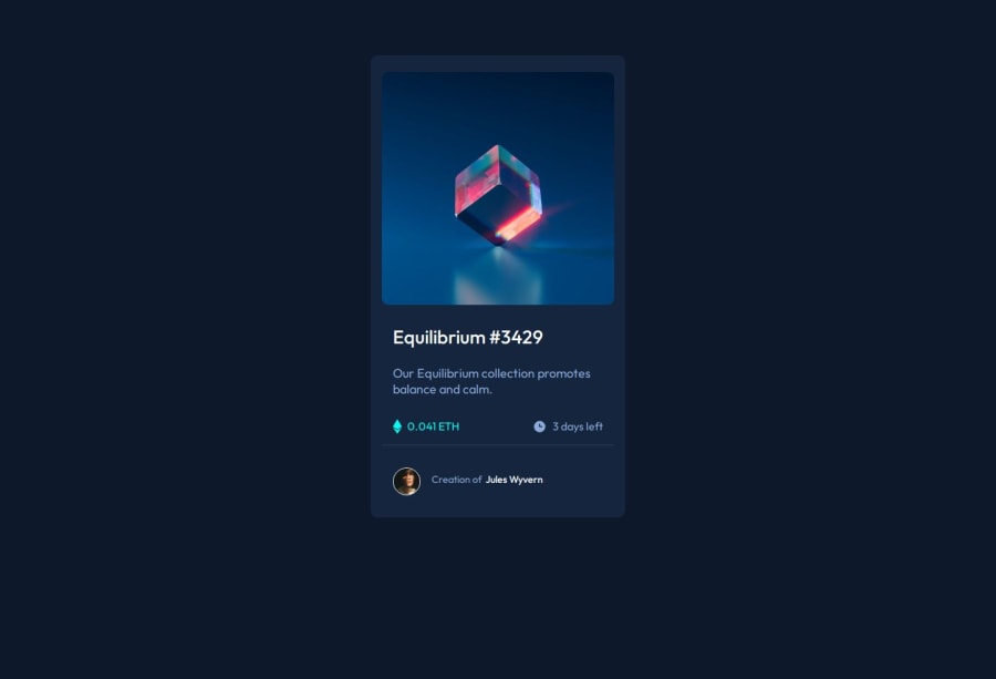
hi, you can see the image is narrower than rest of the content, this is because img-container has static width set. removing static width will have the img conform to parent containers width, like rest of the content below it.
also, media queries appears to be broken. for this project i ignored configuring breakpoints since the card dimensions, typography, spacing etc as is fits a mobile screen. you can try opening the project on mobile phone to see this.
nice transitions
Marked as helpful0@jarthurofvPosted 6 days ago@x-147 Thank you, that was helpful. Also twitched the width of the container for max-width and works so much better now.
1

Please log in to post a comment
Log in with GitHub
Join our Discord community
Join thousands of Frontend Mentor community members taking the challenges, sharing resources, helping each other, and chatting about all things front-end!
Join our Discord