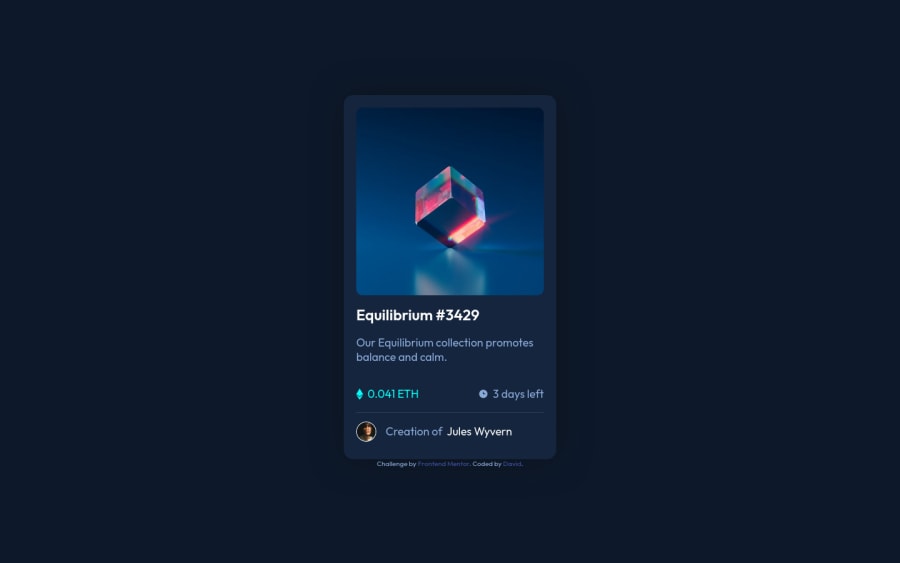
Design comparison
Community feedback
- @VCaramesPosted almost 2 years ago
Hey there! 👋 Here are some suggestions to help improve your code:
- The "NFT image"
alt tagdescription needs to be improved upon ⚠️. Assume that you are describing the image to a someone over the phone.
More Info:📚
https://www.w3.org/WAI/tutorials/images/
- The profile image is not decorative ⚠️. The
alt tagshould not be blank. It should state the following; “Headshot of -person’s full name-“. You also want to remove thearia-hidden="true".
More Info:📚
- The web development process can be made easier and expedite the process 🚀 by implementing a
CSS Reset. Here are some examples that you can freely use 😁: Josh Comeau Reset, Eric Meyer Reset
If you have any questions or need further clarification, feel free to reach out to me.
Happy Coding! 🎆🎊🪅
Marked as helpful0 - The "NFT image"
- @HassiaiPosted almost 2 years ago
To center .card on the page using flexbox, replace the height in the body with min-height: 100vh.
Use relative units like rem or em as unit for the padding, margin, width values and preferably rem for the font-size values, instead of using px which is an absolute unit. For more on CSS units Click here
Hope am helpful.
Well done for completing this challenge. HAPPY CODING
Marked as helpful0
Please log in to post a comment
Log in with GitHubJoin our Discord community
Join thousands of Frontend Mentor community members taking the challenges, sharing resources, helping each other, and chatting about all things front-end!
Join our Discord
