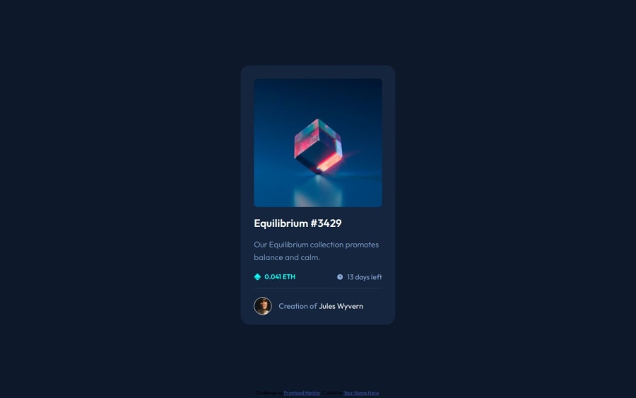
NFT Preview Card Component - Vanilla
Design comparison
Solution retrospective
Nothing specially, wasn't difficult.
What challenges did you encounter, and how did you overcome them?I have hard time controlling images in the correct way, I know some hacky way but I have to learn best practices.
What specific areas of your project would you like help with?Overall code review, especially the ways I put them in container and also how to control image sizes in the right way.
Community feedback
- @Grimm-NPosted 5 months ago
Great job on the work—you're absolutely nailing it! 🌟 Keep going, you're on the path to mastery!
Here are a couple of suggestions to make it even better:
-
Try using relative units like
rem,em,%,vh, andvwinstead of pixels. It’s best to use these everywhere, as they help create a more responsive and scalable design. -
Consider using BEM (Block Element Modifier) for naming your classes. This naming system keeps things organized and readable, especially as your project grows. With BEM, you’ll instantly know what each class does and avoid naming conflicts—making your code easier to maintain and scale!
1P@Bamo-D-AbdallahPosted 5 months ago@Grimm-N Thanks for the feedback but I didn't use any
pxand already used BEM style for my class names.0@Grimm-NPosted 5 months ago@Bamo-D-Abdallah Oops, my bad! 😅 Looks like I peeked into the wrong folder. Guess the mix-up happened because you put all your projects in one repo… makes sense! But hey, great work nonetheless! 👏🚀
Marked as helpful1 -
Please log in to post a comment
Log in with GitHubJoin our Discord community
Join thousands of Frontend Mentor community members taking the challenges, sharing resources, helping each other, and chatting about all things front-end!
Join our Discord
