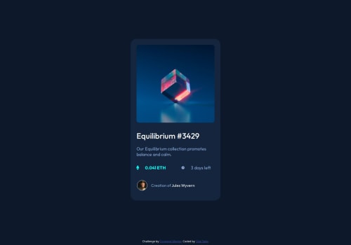
NFT Preview Card Challenge

Solution retrospective
I am starting to get better at things now and rarely ever require a tutorial for help.
What challenges did you encounter, and how did you overcome them?The line where we write "0.041 ETH" has an icon on its left, and same with the "3 days" line. I created 1 div for the whole thing and then divided them into 2 divs for each of the lines. But when I do display:flex, there exists a gap between the icon and the value which I cannot get rid of no matter what. I have tried multiple things for it but in vain.
What specific areas of your project would you like help with?I would like to get help regarding the issue I stated above that how can I overcome this problem in future and know what is happening inside the code.
Please log in to post a comment
Log in with GitHubCommunity feedback
No feedback yet. Be the first to give feedback on TalalTahir01's solution.
Join our Discord community
Join thousands of Frontend Mentor community members taking the challenges, sharing resources, helping each other, and chatting about all things front-end!
Join our Discord