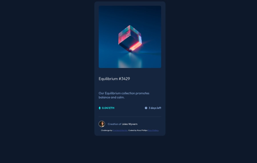
NFT preview card built with flexbox/sass


Design comparison

Solution retrospective
Hey community,
I'd love some feedback here. I've got an intermediate understanding of modern layout techniques, and I am always eager to learn. Here's a few questions for the community.
Setting the width and height of the parent containers - what's the "correct" way to do this? I want to make everything into a flex container, but I can't set a defined width/height on those. Do I set that rule on the body element, main, html, a container? In this instance, the desktop width of the primary container should be 1440px and the mobile width should be 375px. I tried to implement those rules, but I'm not sure they are correct.
Media queries - in this example, there really is no "mobile view" but this relates to the question above. I built it mobile-first and then set a media query with min-width (875px) to change the size of the parent container in a desktop view.
Lastly, absolute vs. relative positioning. Am I doing this correctly in this example? It's easy to lose track of what's being positioned in relation to what.
I have access to the Figma and I know how to read the styles. Any tools or tricks that I'm missing to set myself up for pixel-perfect design?
Any and all feedback is welcome if anyone has any suggestions. Thank you!!!
Community feedback
Please log in to post a comment
Log in with GitHub
Join our Discord community
Join thousands of Frontend Mentor community members taking the challenges, sharing resources, helping each other, and chatting about all things front-end!
Join our Discord