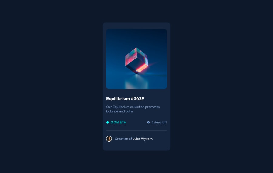
NFT Preview card build with SCSS
Design comparison
Please log in to post a comment
Log in with GitHubCommunity feedback
- @PhoenixDev22
Hello @radanovicnikola93 ,
I have some suggestions regarding your solution:
-
You have misused the article tag read more about the article usages in mdn .
-
The avatar's alt shouldn't be empty , you can use
Jules Wyvernfor it. -
the link should be wrapping the main image and either have
Sr-onlytext, anaria-labeloralttext that says where that link takes you. -
For any decorative images, each img tag should have empty
alt=""andaria-hidden="true"attributes to make all web assistive technologies such as screen reader ignore those images in(icon-ethereum, icon-clock). -
No need for
<div class="card--line"> </div>, you can useborder-topforclass="card--author".
-
width: 20rem;an explicit width is not a good way . Remove the width from the main component and change it tomax widthinstead. That will let it shrink a little when it needs to.-
height: 40rem;It's rarely ever a good practice to set heights on elements . Let the content inside the card element dictate the height of it. -
General point: nesting css selectors not a good thing . Really important to keep css specificity as low/flat as possible. The best way to do that is single class selectors
Overall, your solution is good, Hopefully this feedback helps.
-
- @radanovicnikola93
Thanks for the feedback ! :)
Join our Discord community
Join thousands of Frontend Mentor community members taking the challenges, sharing resources, helping each other, and chatting about all things front-end!
Join our Discord
