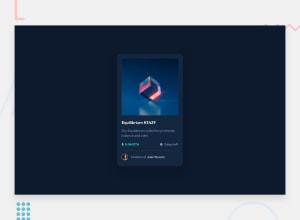
Design comparison
Solution retrospective
I'm most proud of the clean and responsive design of the NFT preview card component. The use of flexbox for layout and the subtle hover effects provide a professional and polished look, making the component visually appealing and user-friendly. It's rewarding to see how the component enhances the overall user experience with its sleek design and smooth interactions.
What challenges did you encounter, and how did you overcome them?Flexbox layout complexity, ensuring that the card component was perfectly responsive across different screen sizes and resolutions was a bit challenging. Flexbox is powerful, but it can sometimes be tricky to get everything aligned just right, especially when dealing with nested flex containers.
secondly, Creating a hover effect that was both subtle and impactful without disrupting the overall design required several iterations. I wanted the effect to be noticeable yet not overwhelming.
I spent time thoroughly reading and experimenting with Flexbox properties. Online resources like CSS-Tricks and MDN Web Docs were invaluable. I also used browser developer tools extensively to debug and refine the layout.
What specific areas of your project would you like help with?any guidance on improving accessibility and ensuring the component is fully responsive across a wider range of devices and screen sizes would be greatly appreciated
Community feedback
Please log in to post a comment
Log in with GitHubJoin our Discord community
Join thousands of Frontend Mentor community members taking the challenges, sharing resources, helping each other, and chatting about all things front-end!
Join our Discord
