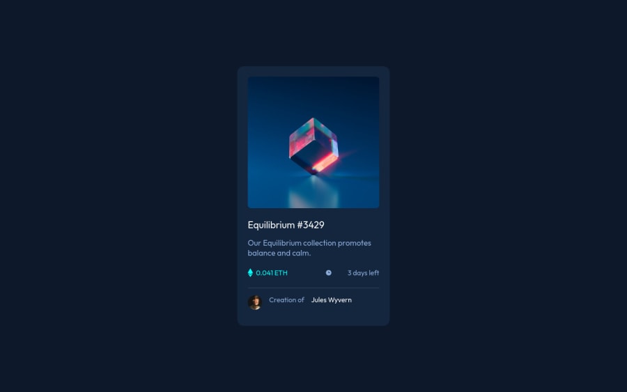
Design comparison
Community feedback
- @RioCantrePosted over 2 years ago
Hello there! Nice job in completing this project. Regarding your solution, I would like to recommend the following for you…
- Add the hover state of the design. For the hero image , refer it with this one Overlay in image. For the fonts, add
color: hsl( var(--cl-primary-light) / 1);andcursor: pointer;in.card-titleand.linkrule sets - Add
border: 1px solid white;andborder-radius: 50%;in.card-avatarrule set - Include description with the
altin image tags. Like this line<img src="./images/icon-ethereum.svg" alt="">
Above all, the project is done well. Keep up the good work and Hope this is helpful!
Marked as helpful0@cchiversPosted over 2 years ago@RioCantre Thanks for the reply!!! You are a life saver with the overlay in image. I could not figure it out. I want to play around with this more and try and understand it better. Again thank you!
0 - Add the hover state of the design. For the hero image , refer it with this one Overlay in image. For the fonts, add
- @jrmydixPosted over 2 years ago
Hi! Well done!
If this can help, I have a suggestion:
- Fix accessibility issues: to do so, change your
<h4>to<h1>. For the landmark issue, change<div class="attribution">to<footer>.
If you have any questions feel free to ask, I'll try my best to help and answer! 🙂
Marked as helpful0@cchiversPosted over 2 years ago@jrmydix Thank you, it is definitely something I am working on fixing accessibility issues overall.
1 - Fix accessibility issues: to do so, change your
- @optimusprime202Posted over 2 years ago
Hey @cchivers, Now you’ve figured it out.
0
Please log in to post a comment
Log in with GitHubJoin our Discord community
Join thousands of Frontend Mentor community members taking the challenges, sharing resources, helping each other, and chatting about all things front-end!
Join our Discord
