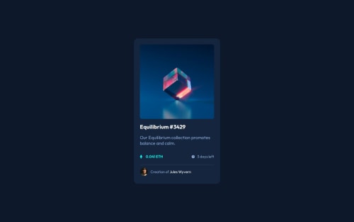
NFT-preview-card

Solution retrospective
I'm proud of utilizing advanced CSS techniques such as pseudo-elements, mixins, and responsive breakpoints.
Next time I will try to optimize images and other assets to improve loading times and overall performance, especially for users on slower connections.
What challenges did you encounter, and how did you overcome them?Challenge: Adding hover effects with pseudo-elements, such as the cyan overlay and the eye icon, while ensuring they did not interfere with other content.
Solution: Applied CSS ::before and ::after pseudo-elements correctly and used absolute positioning within a relative parent container. This kept the effects isolated to the intended elements.
What specific areas of your project would you like help with?Basic accessibility features are implemented, but there might be room for improvement.
Please log in to post a comment
Log in with GitHubCommunity feedback
No feedback yet. Be the first to give feedback on Amit-R328's solution.
Join our Discord community
Join thousands of Frontend Mentor community members taking the challenges, sharing resources, helping each other, and chatting about all things front-end!
Join our Discord