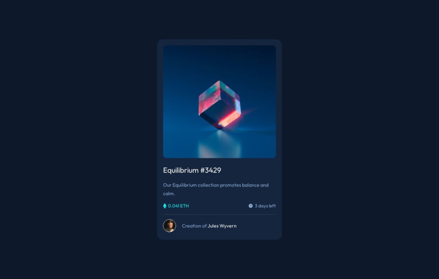
Design comparison
SolutionDesign
Solution retrospective
NFT Preview Card , I'd Love To Hear Your Thoughts <3 ;)
Community feedback
- @BlackpachamamePosted 10 months ago
You have done a good job 😃
I can suggest the same thing as in the comment I made in the other challenge, in addition:
- You can apply
display: blockto yourimg, this will remove that white space that is generated below the image - With that change, you will also have to modify your
.container .image::after. You just have to change theheight: 99%toheight: 100%for it to look correct
Marked as helpful1 - You can apply
Please log in to post a comment
Log in with GitHubJoin our Discord community
Join thousands of Frontend Mentor community members taking the challenges, sharing resources, helping each other, and chatting about all things front-end!
Join our Discord
