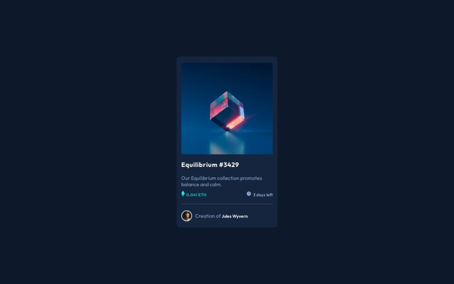
NFT Preview Card


Design comparison

Solution retrospective
Hello, Frontend Mentor community. This is my solution for the NFT Preview Card challenge 👋
This is challenge 3 where I provide comprehensive guidance to fellow developers by adhering to industry best practices. By focusing on key areas such as
- Semantic HTML
- Clean web page structure
- CSS enhancements
- Accessibility
- Performance Optimization
Today I want to share with you the advantages of using utility css class
- utility class are css classes that applies a single rule or a very simple pattern.
Benefits
-
dryness & consistency
-
help you reduce repetition and unintentional inconsistency in your styling
-
you can alter the value in one place instead
-
-
file size
- by reducing repetition, you reduce the file size which results in improving your page performance.
3- specificity
- they also make it possible to creawte element specific overrides without writing high specificity varients.
Utility classes i used in this challenge
.clr-white{
   color:white;
}

.clr-cyan{
   color:var( --color-primary-cyan);

}
.fw-2{
   font-weight:var(--weight-2);
}
.fw-3{
   font-weight:var(--weight-3);
}
.ml-2{
   margin-left:0.2rem;
}
.my-2{
   margin-block:2rem;
}
.my-1{
   margin-block:1rem;
}
I aim to address common mistakes observed in the challenges submitted by other participants. Through this initiative, I hope to not only solve newbie-level projects but also share valuable insights and tips to aid in their learning journey. As a part of this initiative, I started a series Frontend Mentor - Learning from mistakes on Linkedin where I share common mistakes I found in newbies / junior challenges to assist all fellow newcomers in avoiding these pitfalls
Kindly note that I increased the font size and font weight for better readability
Community feedback
- @OmarRefaeePosted over 1 year ago
Hi Mennatallah
Well done doing the challenge.
here are some suggestions:
1 - it will look better if all card padding are 2rem instead of 2rem 1.5rem
2 - Make the label display flex so the icon aligned with the text
3 - and icon margin-right 0.5rem
Good Luck in the next challenge.
0

Please log in to post a comment
Log in with GitHubJoin our Discord community
Join thousands of Frontend Mentor community members taking the challenges, sharing resources, helping each other, and chatting about all things front-end!
Join our Discord