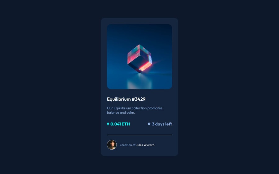
Design comparison
Solution retrospective
What I'm most proud of: I'm especially proud of the seamless hover overlay effect and the way it adds interactivity to the NFT card. Achieving smooth, visually appealing animations that enhance user experience was a rewarding challenge. Additionally, I'm proud of how the project is fully responsive, creating a consistent experience across different devices.
What I'd do differently: Next time, I'd like to experiment with advanced accessibility features, such as ARIA labels and keyboard navigation, to ensure that all interactive elements are accessible to users with disabilities. I’d also like to refactor some components into custom hooks to improve reusability and maintainability, especially for handling UI state and animations.
What challenges did you encounter, and how did you overcome them?One of the main challenges I faced was making the overlay cover only the NFT image without impacting the surrounding card layout. Initially, the overlay was taking up too much space, affecting the design. I resolved this by creating a dedicated container with position: relative to control the overlay’s dimensions precisely. Another challenge was ensuring responsive scaling for different screen sizes. I used flexible units like em and vh/vw and set media queries to fine-tune the layout on smaller screens, which solved the problem effectively.
These challenges taught me more about managing layered elements in CSS and the importance of responsive design principles, which I’ll carry into future projects.
What specific areas of your project would you like help with?I’d love feedback on optimizing the code structure, particularly for reusability and performance. Specifically, I'd like advice on:
Optimizing animations: Are there best practices to make CSS transitions even smoother, especially when multiple animations are involved? Improving accessibility: I’ve implemented basic accessibility features, but I’d appreciate guidance on making the project more accessible for a wider audience. Advanced React patterns: I’m interested in learning more about custom hooks or context to manage complex state and streamline component logic for a project of this scale. Any input on these areas would be invaluable as I work on building more complex, user-friendly applications!
Community feedback
Please log in to post a comment
Log in with GitHubJoin our Discord community
Join thousands of Frontend Mentor community members taking the challenges, sharing resources, helping each other, and chatting about all things front-end!
Join our Discord
