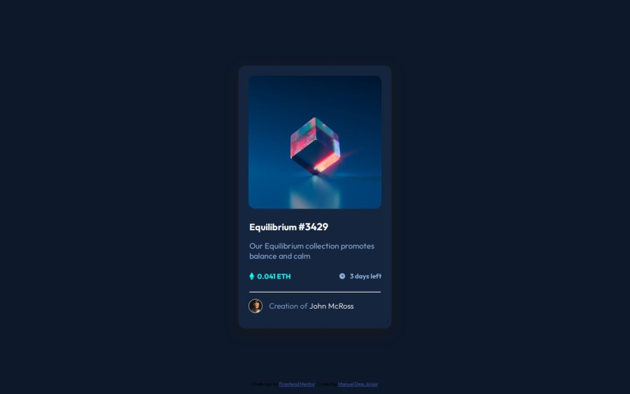
Design comparison
SolutionDesign
Solution retrospective
Project was quite easy since all resources where provided,
But I'm having difficult to set up a proper footer.
Community feedback
- @grace-snowPosted 8 months ago
This has some html issues that need addressing :
- If the design shows a hover style, that means something is clickable - it's interactive. You've done that for the text but you've done done it for the image.
- Once you've added that missing interactive element you will need to make sure it has an appropriate accessible name.
- Why have you opted for h3 as the main heading? That might be fine but I want to understand your reasoning there.
- You can never jump heading levels like this. Headings must go in order. BUT you are misusing headings anyway. This card only has one heading. The price and time are not appropriate content to act as headings and they have no content under them that "belongs" to them as headings. They should be paragraphs or possibly list items in an unordered list.
1@grace-snowPosted 8 months agoAnd in the html
- Never limit the height of elements that contain text. This component must not have a height, especially in px. Let the browser do it's job and decide what height is needed.
- This is overflowing my mobile screen on the side because you've used an explicit width as well. The component should only have a max width and this must be in rem so it works for all users including those who have a different text size.
- you don't need to add all those border radius prefixed properties. Same with transition. These are extremely well supported properties .
- always use a modern css reset at the start of the styles in every project. Andy Bell has a good one you can look up and use.
- the img must not have an explicit width either. All it needs is width 100%.
- same with the overlay. Height and width 100% not explicit values. I have written up an instructional post on how to do this image hover in an accessible and performant way on the resources channel,in discord if you want to look at that.
- the top and left percentages tell me you are not understanding how to do this overlay correctly. They should not be there as it won't be robust and work for all users. Definitely check the post I mention.
- font size must never be in px. This is extremely important.
- don't set large explicit margins to create a layout. Instead consider layout approaches like flex or grid.
Once you've applied these fixes you will need to go back through previous projects and refactor as well. Most of the above is foundational practices that are needed in every project.
1
Please log in to post a comment
Log in with GitHubJoin our Discord community
Join thousands of Frontend Mentor community members taking the challenges, sharing resources, helping each other, and chatting about all things front-end!
Join our Discord