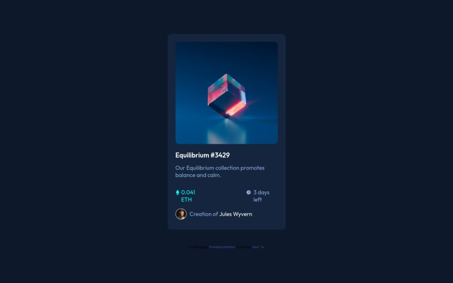
Design comparison
Solution retrospective
i didn't succed to do the overlay effect on this challenge
Community feedback
- @Ibarra11Posted over 2 years ago
You had the right idea with the overlay nesting it within the picture. After that you have to set the overlay to absolute and you want it to fill the entire picture container, so you have to give it 100% width and height. At this point the overlay is sitting on top of the img and once you give it a background it will hide the image. You have two options you can set the overlay to display: none or set its opacity to 0 and when the user hovers over the picture you set the overlay class to either display: block or opacity 1. In my opinion, I think the opacity choice is better, but you can choose which make ever makes sense to you. I'm going to include a code-sandbox if you want to take a look at how I implemented it - Sandbox. https://codesandbox.io/s/objective-galois-chtm1u?file=/index.html
0
Please log in to post a comment
Log in with GitHubJoin our Discord community
Join thousands of Frontend Mentor community members taking the challenges, sharing resources, helping each other, and chatting about all things front-end!
Join our Discord
