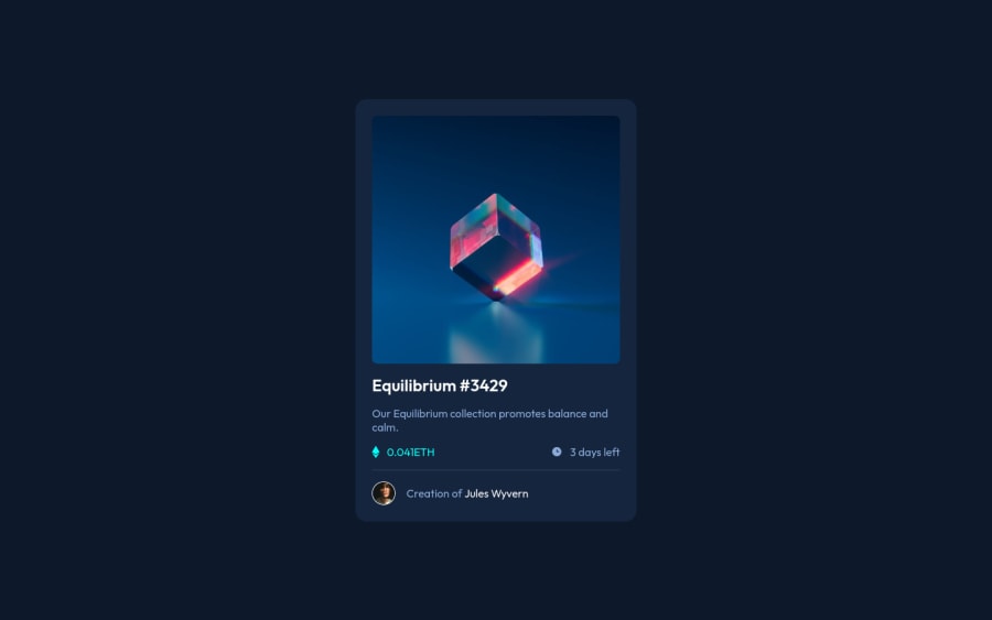
Design comparison
Community feedback
- @grace-snowPosted almost 3 years ago
Hello
This would be much better if you used pseudo elements for the hover effect. It's questionable whether it's even valid html to have divs inside anchor tags.
I suggest using hsla for the background color of the pseudo and making the eye a background image on the pseudo.
Alternatively, you could use 2 pseudo elements and z-index to stack them, so the turquoise layer with the lower opacity sits 'underneath' the pseudo with the eye image.
You definitely need to add
display: block;to the image whatever approach you take. Your overlays are not sitting flush over the image at the moment as it is an inline-block element by default.The other essential change is to improve the label of that link on the image. At the moment the only link content is the alt of the image, which is poorly written. You should never write "image" or "photo" etc in alt text as it is already an image element. If that is the only link content, it needs to say what the image actually does. OR you need an aria-label or sr-only text in that link to say where the anchor tag will take you to.
Looking at the stats, you've not used meaningful elements there. It's important to always use meaningful elements for text, never just a div or span. It would be improved if you made
statsan unordered list, andvalueexpiryinto list items.I don't think it makes sense using a footer element like you have at the moment. It would kind of make sense if this was an article, not a section. But even then, although it's considered OK, it's really annoying to screenreader users when there are loads of headers/footers on a page. Even in articles, it's not usually a nice experience for them. Heading structure is the most important thing for page structure / semantics and you've already nailed that fine!
Good job on this overall. I hope the suggestions are helpful
Marked as helpful1@thomashertogPosted almost 3 years ago@grace-snow first and foremost, thanks a bunch for this very elaborate feedback. I was more focused on finishing it in one evening and taking shortcuts here and there. the suggestions for the hsla were very helpful (along the solution of Remus)
I'm really only starting out with everything a11y related and don't really have lots of experience with testing with screen readers so those comments are essential to improve my current skills. thx!
0 - @MiculinoPosted almost 3 years ago
Congrats on completing the challenge, Thomas!
You did a great job on your HTML and CSS code. I don't have too many comments to make given how well you did the project, but I have a little suggestion for another approach to the overlay effect: instead of adding those HTML elements, you can use the ::after and ::before CSS pseudo-elements to create the effect.
Marked as helpful1@thomashertogPosted almost 3 years ago@Remus432 I tried that, but was struggling with the opacity in that case. Might still revisit that later
0@MiculinoPosted almost 3 years ago@thomashertog You can view my solution for that challenge if you want some inspiration :)
0
Please log in to post a comment
Log in with GitHubJoin our Discord community
Join thousands of Frontend Mentor community members taking the challenges, sharing resources, helping each other, and chatting about all things front-end!
Join our Discord
