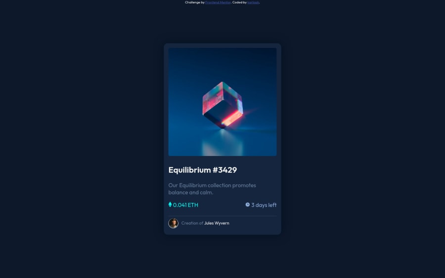
Design comparison
Solution retrospective
btw i hate nft's
Community feedback
- Account deleted
Hey @karliask, some suggestions to improve you code:
-
It is best practice to use, Classes for your naming convention as classes are reusable, making them ideal for CSS styling. IDs on the other hand, are not reusable and are mainly used for JavaScript.
-
Your “NFT image” needs an Alt Tag. It should describe what the image is; it need to be readable. Assume you’re describing the image to someone.
-
For the icons and text, you want to use the
display: flexalong withalign-items: centerto have them horizontally aligned to each other. -
The profile image needs an Alt Tag. It should state the following; “Headshot of -person’s full name-“
-
Wrap the "NFT image", "Equilibrium #3429" and "Jules Wyvern" in an Anchor Tags <a>. The anchor tag will allow users to click on content and have them directed to another part of your site.
-
Your content Is not responsive. You want to use responsive properties.
Happy Coding! 👻🎃
0 -
- @kylejrhodenPosted over 2 years ago
This looks pretty great! btw you can throw those .attribution properties in your css to clean up that head element if you want.
0
Please log in to post a comment
Log in with GitHubJoin our Discord community
Join thousands of Frontend Mentor community members taking the challenges, sharing resources, helping each other, and chatting about all things front-end!
Join our Discord
