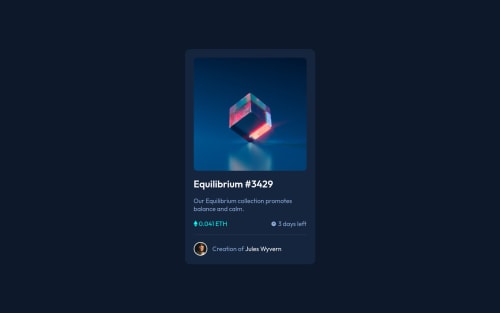
Design comparison
SolutionDesign
Solution retrospective
Hi! thank you for seeing my soulution. I'm open, and please tell me how to do it better!
Community feedback
- @zeerobitPosted almost 3 years ago
Good work completing this challenge, couple of pointers:
- you should use rem instead of px since px is not scalable
- wrap the equilibrium image in an anchor since it's supposed to be an interactive element
- A simpler way to position the icon-view image without using any margin or pseudo element, same for the background-color would be to add a div in the html after the ".img-container" you could name it ".overlay" then add the icon-view image inside of it also wrapped in a anchor tag for interactivity. So in your css you could set the width and height to 100% for the ".overlay" div then use position absolute to place it on top of the ".image-container". Add the background-color in rgb so you can add the opacity value, it should be like this
background-color: rgb(0, 255, 247, 0.4);
hence 0.4 is the opacity value, then use flexbox on the ".overlay" to center the icon-view image . Addopacity: 0
in the overlay div to make the background-color and the icon-view invisible then for the hover effect add 'opacity: 1`
Hope this helps, Happy coding !!!
Marked as helpful0 - @denieldenPosted almost 3 years ago
Hi Carlos, great job! Congratulations on completing the challenge.
Try to add a little
transition
on the element with hover effectOverall you did well :)
Hope this help and happy coding!
Marked as helpful0
Please log in to post a comment
Log in with GitHubJoin our Discord community
Join thousands of Frontend Mentor community members taking the challenges, sharing resources, helping each other, and chatting about all things front-end!
Join our Discord