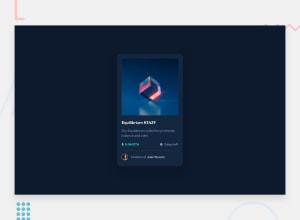
Design comparison
Solution retrospective
Hi Everyone! I finished the challenge and I'm really happy with how it came out. I'm looking for any feed back you might think would be helpful, and I'm very interested in your input on the code itself concerning legibility, organization, content structure, as well as drying up the code. Is there some place where I could have condensed it better? Is there a way I can make it more reusable if someone wanted to make changes, updates, or any other adjustments? Are there any accessibly additions or changes that would benefit the program? Are there any questions you have for me on why I chose to do something the way I did? I always appreciate your feedback and so far it has always been very helpful and educational! Thanks in advance y'all! -Slim
Community feedback
- @A-amonPosted almost 3 years ago
Hello! Awesome job~ 😀
I've got a few suggestions:
- Set
position:relative;on.image-containerso that the eye icon/image 👁 is center of this parent container. - The clock icon 🕑 isn't vertically aligned with the '3 days left'. You can fix this by setting
display:flex; align-items:center;- Set the
altattribute on your images. I noticed some of them don't have it. You can leave the value empty like this:alt="". 😉 - This might just be me but, the
cursor:pointer;and color change on hover makes the text in.creator-containerlooks like a link so, maybe just change theptag to anatag instead since it's possible for it to be a link. 🔗
Marked as helpful1 - Set
Please log in to post a comment
Log in with GitHubJoin our Discord community
Join thousands of Frontend Mentor community members taking the challenges, sharing resources, helping each other, and chatting about all things front-end!
Join our Discord
