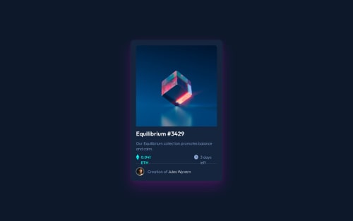
Design comparison
Solution retrospective
I used @media (orientation: landscape) instead of fixed pixels to show the desktop layout, I'm not sure if that's bad practice, also I think my CSS is too messy
Community feedback
- @StormKing969Posted over 2 years ago
Hi,
Let me begin by saying congratulation for completing this challenge. As for your question about organizing your CSS file, I believe that you can do two thing (speaking from personal experience):
- First you can section off your components with comments and basically group everything that is related together. (However, I stopped doing that because once your CSS file has more than 100 lines, it becomes hard to locate specific tags)
The link below is an old portfolio project of mine that shows what I mean by sectioning off your file into components using comments and also the issue that I mentioned above
https://github.com/StormKing969/Personal-Portfolio/blob/main/assets/css/styles.css
- The second way is to learn SASS/SCSS. It's very easy to learn and you can easily link several different styling files into one. For example in your case, you could have one file to store all your variables, another to store the default values of your tags and a third one to style the card itself. This makes going back to your file and locating specific tags easy and
The link below is an example on how I used SCSS to style my project
https://github.com/StormKing969/Personal-Portfolio-Version-2/tree/main/scss
1 - @sqle157Posted over 2 years ago
Hi,
First of all, congratulation for completing this challenge. I think you did a pretty nice job, and I have some tips from my personal experience to help you organize your CSS.
- I see that you have some classes like
middle
,flex-type
,text-accent
, ... which are the utilities classes, you can group those classes into 1 comment block, like this
.flex-type { your code } .middle { your code } .text-accent { your code }
I think that will help you create a more readable and organized structure for your CSS.
- You can group your component CSS base on your HTML structure from top to bottom. Also, if you have any hover effect or anything for your component, try to write it right after your css for your component. For example, if you have a hover effect on your card, you can write your CSS like this
.card { ... } .card:hover { ... }
I recommend watching Kevin Powell and Traversy Media on Youtube. They have great content for CSS and Frontend Skills in general, and I think you will learn a lot from them!
1 - I see that you have some classes like
Please log in to post a comment
Log in with GitHubJoin our Discord community
Join thousands of Frontend Mentor community members taking the challenges, sharing resources, helping each other, and chatting about all things front-end!
Join our Discord