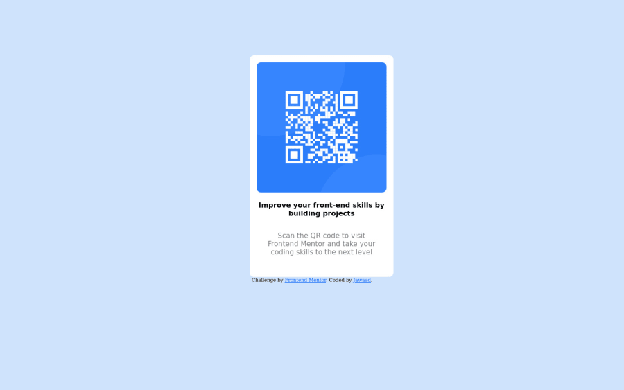
Design comparison
SolutionDesign
Community feedback
- @optimusprime202Posted almost 3 years ago
Hey @jaaw, Congratulations, you got it right!
0 - @denieldenPosted almost 3 years ago
Hi Jawaad, I took some time to look at your solution and you did a great job!
Also I have some tips for improving your code:
- remove all
marginfromcardclass - try to use flexbox to the body for center the card. Read here -> best flex guide
- after add
min-heigth: 100vhto body because Flexbox aligns to the size of the parent container - For add the top image in the background just put more specific background properties to the body:
background: url("../img/pattern-background-desktop.svg") no-repeat top center;
background-size: contain;
background-color: #e0e8ff;
Overall you did well :)
Hope this help and happy coding!
0 - remove all
Please log in to post a comment
Log in with GitHubJoin our Discord community
Join thousands of Frontend Mentor community members taking the challenges, sharing resources, helping each other, and chatting about all things front-end!
Join our Discord
