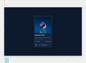
Design comparison
SolutionDesign
Solution retrospective
Took a break now getting back into things! Open to all feedback and comments!!
Community feedback
- @vanzasetiaPosted almost 2 years ago
Hi, Coty B! Welcome back! 👋
Here are a few suggestions for improvements.
- Wrap the Equilibrium image with an anchor tag. Any element that has interactivity should be wrapped by an interactive element.
- Wrap
<a href="#" class="component-title">Equilibrium #3429</a>with an<h1>. Each page should have one<h1>. - Alternative text for images should not contain any words that are related to "image" (e.g. picture, photo, logo, icon, graphic, avatar, etc). It is already an image element (
<img>) so the screen reader will pronounce it as an image. - Set
box-sizing: border-boxon all elements instead of only on the<body>element using universal selector (*). - Prefer unitless numbers for line-height values to avoid unexpected results. Learn more — line-height - CSS: Cascading Style Sheets | MDN
- Never use
pxunit for font sizes. Useremoreminstead. Relative units such asremandemcan adapt when the users change the browser's font size setting.
I hope this helps. Happy coding! 😄
Marked as helpful0
Please log in to post a comment
Log in with GitHubJoin our Discord community
Join thousands of Frontend Mentor community members taking the challenges, sharing resources, helping each other, and chatting about all things front-end!
Join our Discord
