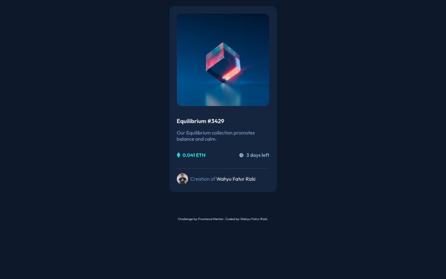
NFT Component by Wahyu Fatur Rizki
Design comparison
Community feedback
- @PhoenixDev22Posted about 3 years ago
Hello @wahyufaturrizky ,
I have some suggestions regarding your solution:
<Footer>should not be in the<main >.-
You are misusing the
<section>tag . section is not meant to be used anytime you feel tempted to use a div . section is for a bigger chunk of content often titled by<h2>Read more aout usage notes.- You can add a
<h1>withclass="sr-only"(Hidden visually, but present for assistive tech). And use<h2>instead of<h3>
- You can add a
-
Anything with a hover style in design means it's interactive. you need to add an interactive element
<a>around the imageEquilibrium #3429 and Jules Wyvern. -
<svg> 's do not add important information to a document should be considered decorative. You can usearia-hidden="true"to hide the SVG from screen readers.focusable="false"is also used to ensure Internet Explorer won’t allow the Tab key to navigate into the SVG in(icon-ethereum, icon-clock). -
The avatar's alt shouldn't be
avatar-authorit's meaningless , you can useJules Wyverninstead . -
the link should be wrapping the main image and either have
Sr-onlytext, anaria-labeloralttext that says where that link takes you. -
Give the main image
display : block;, that would remove the little gap I see under the image. -
you can use the flexbox properties and
min-height: 100vhTo center the card on the middle of the page .
.container-layout {
    background-color: #0d192b;
    /* height: 100vh; */
    padding-top: 20px;
    display: flex;
    align-items: center;
    justify-content: center;
    flex-direction: column;
    min-height: 100vh;
}
And you can remove the margin from
.container-card-
width: 347pxan explicit width is not a good way . Remove the width from the main component and change it tomax widthinstead. That will let it shrink a little when it needs to. -
You should use
emandremunits .Bothemandremare flexible, Usingpxwon't allow the user to control the font size based on their needs. -
You can use
<ul>instead of the section . And in each<li>, there would be<svg>and<p>. -
For the avatar's part , you can use
<figcaption >and<figure>. -
General point : remember a css reset on every project. That will do things like set the images to display block and make all browsers display elements the same
Overall, your solution is good, Hopefully this feedback helps.
0 -
Please log in to post a comment
Log in with GitHubJoin our Discord community
Join thousands of Frontend Mentor community members taking the challenges, sharing resources, helping each other, and chatting about all things front-end!
Join our Discord
