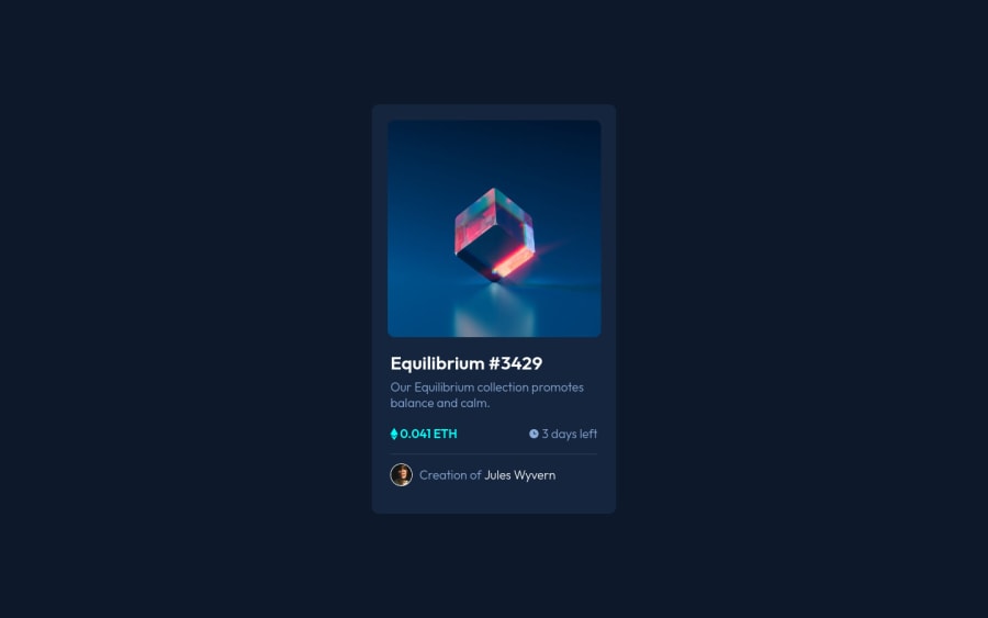
Design comparison
SolutionDesign
Solution retrospective
- I would like to fix the overlay.
- In Safari my entire component seems to be stretched, but in Brave, it looks centered. Any fix would be helpful
- Any ideas, feedback, pointers are welcome.
Community feedback
- @RioCantrePosted almost 3 years ago
Hello there! Good job in this challenge. Viewing the solution, I think you should consider the following as well…
- Import the
attributionstyle in CSS file and remove thestyletag - Remove unnecessary code to keep it clean
- Add the hover state of the design. For the hero image , refer it with this one Overlay in image
Above all, Well done! Keep it up and Hope this is helpful!
0 - Import the
- Account deleted
Hello there! 👋
Congratulations on finishing your challenge! 🎉
I have some feedback on this solution:
-
Always Use Semantic HTML instead of
divlike<main><header>, etc for more info -
you can add the image and background color on hover with pseudo elements
:before & ::after
if you are not sure what i am talking about you can learn from my example.
if my solution has helped you do not forget to mark this as helpful!
0 -
Please log in to post a comment
Log in with GitHubJoin our Discord community
Join thousands of Frontend Mentor community members taking the challenges, sharing resources, helping each other, and chatting about all things front-end!
Join our Discord
