Design comparison
Solution retrospective
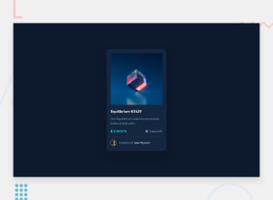
I loved this one! I was learning about react's libraries for styling and decided to built with one of them: Styled components!
I tried to differ a little from the original project, i settled the ground for some additional things - like an section with different nfts and so on -.
One thing that was a struggle for me was deciding what tag to use, is there any good practice for building product cards like this one? I used article, h2, figure (figure, figcaption and img) and p, did i done it right?
I might have done some mistakes, so i would love some feedback.
Community feedback
- @11kylePosted over 2 years ago
Great work! I really like that you took the challenge and added your own twist. The only negative thing I noticed is the colors used. I feel like the neon green text with a green background is hard for the eye to pickup.
As for your question about when to use article, h2, etc. Here's a very good link on what elements should be used and why. Some key benefits to using the right elements include better readability and improved SEO.
Marked as helpful1@LukiticasPosted over 2 years ago@11kyle thanks! This was my first approach in using two themes in one project, so i ended up with those funky colors... i'm not good at picking colors palettes 😅.
1@11kylePosted about 2 years ago@Lukiticas I don't remember what website has this feature, but I came across a site that let you put in a color and it would return colors that were complimentary. It was definitely cool and I wish I remembered it lol.
0
Please log in to post a comment
Log in with GitHubJoin our Discord community
Join thousands of Frontend Mentor community members taking the challenges, sharing resources, helping each other, and chatting about all things front-end!
Join our Discord
