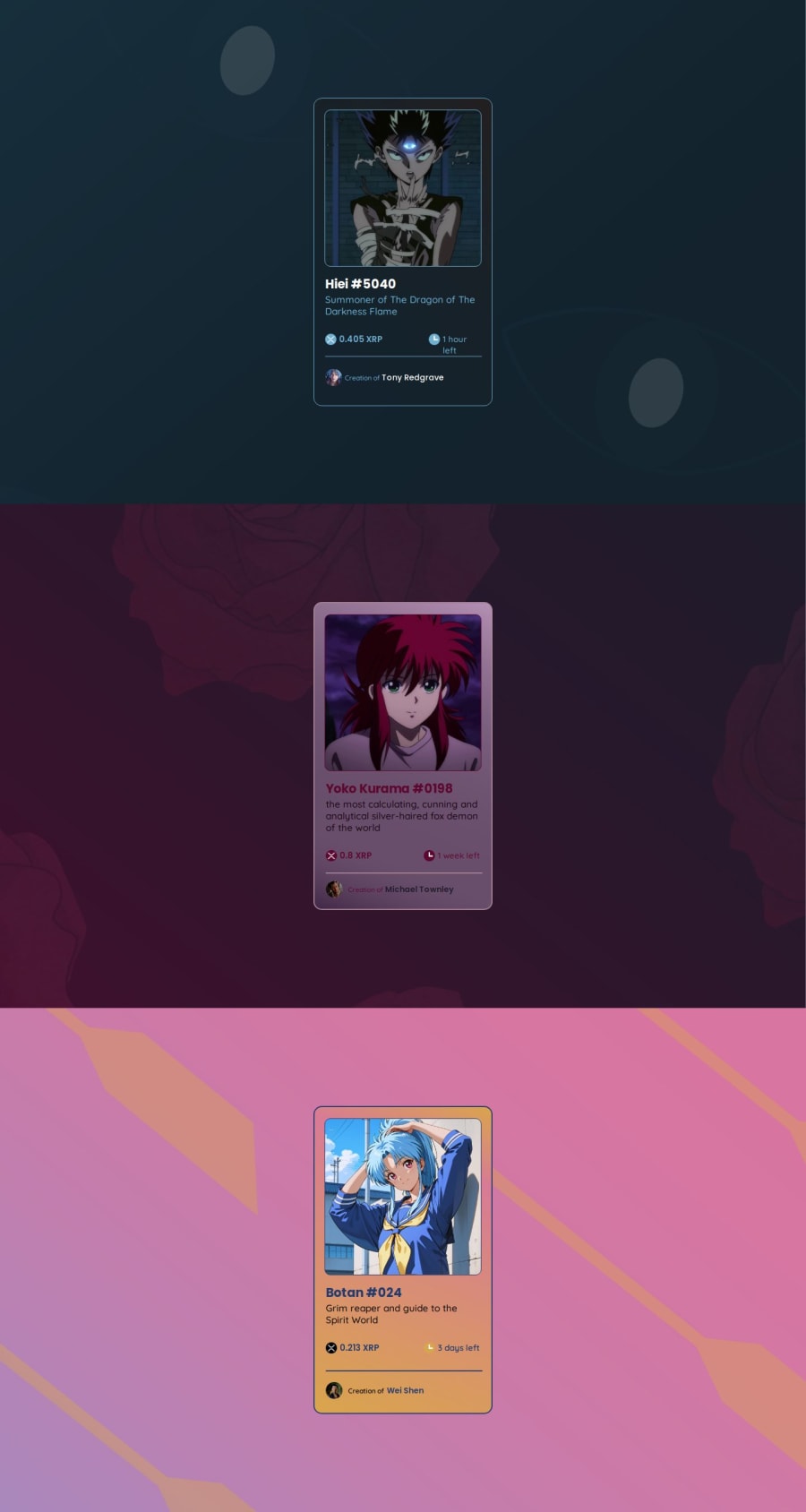
Design comparison
Solution retrospective
Would start doing the content before try center it divs, proud about responsivity and favicon
What challenges did you encounter, and how did you overcome them?Define displays and positions, practice made me understand well this properties (not enough, but better than before i did it)
What specific areas of your project would you like help with?Would like make cards bigger on desktop, but do not loss the responsivity on different screens sizes
Community feedback
- @MohammedOnGitPosted 2 months ago
Hello benssssss!
Congratulations on completing the challenge. You did awesome! Your HTML structure is well-organized and demonstrates a solid understanding of semantic elements. However, here are some recommendations and comments in terms of web development best practices:
- Accessibility: Alt text for images: The <img> tags have empty alt attributes. To improve accessibility, include meaningful alt text that describes the images. For example:
Headings: The use of headings is good, but ensure that you use them semantically and in a hierarchical manner. Each card has an <h1> tag, but generally, there should only be one <h1> per page. Consider using <h2> for the NFT names and <h3> for descriptions. The general structure should look like:
<h2 class="h1-do-hiei">Hiei #5040</h2> <h3 class="h2-do-hiei">Summoner of The Dragon of The Darkness Flame</h3>- SEO Optimization: Meta description: Consider adding a meta description for search engine optimization:
Title optimization: The title is good, but could be more descriptive:
<title>NFT Card Shop - Unique Digital Collectibles</title>- CSS Organization: CSS Linking: You're linking both reset.css and style.css. Ensure that reset.css comes before style.css to avoid overwriting styles. This order is correct in your code. Consider BEM for class naming: Your class names, like hiei-geral, kurama-card, and dados-compra-hiei, could be more descriptive using a naming convention like BEM (Block Element Modifier). This will make your CSS more modular and scalable: Example:
.card--hiei { } .card__price--hiei { }
- HTML Semantics: Semantic structure: Consider wrapping each card in a <section> or <article> tag for better semantic meaning. This tells the browser that each block of content is its own distinct section:
- Image Optimization: Lazy loading: Consider adding lazy loading to your images to improve the performance of your website:
File paths: Your image paths seem unnecessarily long (e.g., src/hiei-asstes-prontos/hiei-clock.png). Consider organizing them into folders more effectively and using relative paths. Also, double-check that the paths to all assets are correct to prevent broken images.
- Performance Optimization: Preloading fonts: You’re loading Google Fonts, which is great. Consider using rel="preload" for performance enhancement:
-
Maintainability: Componentization: If you are working on a larger project, consider moving this structure to a component-based framework like React, Vue, or Angular. This would help you reuse card components effectively across different pages.
-
General HTML Cleanup: Use of whitespace and indentation: Your code is well-indented and structured, which makes it easy to read. Keep this up across larger projects. By making these improvements, your NFT Card Shop page will be more accessible, optimized for performance, and easier to maintain over time. Keep up the great work!
Marked as helpful1@benssssssPosted 2 months ago@Aggressive-Mohammed Hi i modify the code, did change the classes, and erase a lot unnecessary code, put alternative "alt" text, and <pictures> between <images>, changed h1 to h2 and h3 too, it get lot better following your comment, thank you very much for the help, if would you want check it again, is on github
0
Please log in to post a comment
Log in with GitHubJoin our Discord community
Join thousands of Frontend Mentor community members taking the challenges, sharing resources, helping each other, and chatting about all things front-end!
Join our Discord
