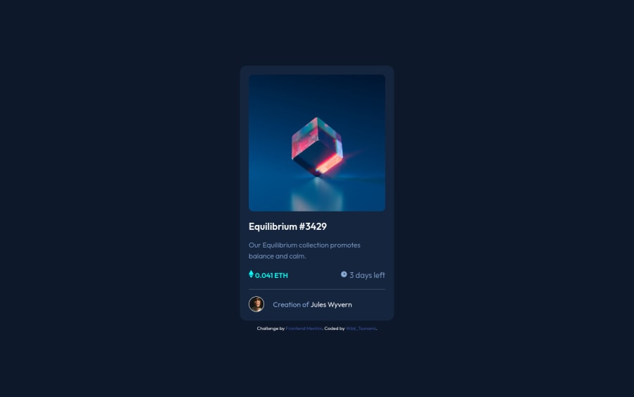
Design comparison
Solution retrospective
I didn't know how to make the :hover with the top image, but otherwise it was pretty simple.
Still taking advices of course, I'm a begginer and want to improve :)
Community feedback
- @martinelias1312Posted almost 3 years ago
Hello @WildTsunami, look at my solution how i have done it. I started with the variable cyan color and changed its opacity to 50%. (:root section).
One more suggestion:
- alternate text can be left blank if images are only decorative, like icons of ethereum or clock.
If you have any questions and don´t understand something from my code, feel free to ask!
Marked as helpful2@WildTsunamiPosted almost 3 years ago@smradupan I looked at your code and upgraded mine. Not total copy though, but I understand what you did, that's pretty smart. Thank for your help !
0 - @Saran-73Posted almost 3 years ago
Hi ,you can do that by creating a div with same image size create(:before) pseudo element give it backround color then centre the icon inside then make it position absolute to place it above the img and use the opacity and z- index property. To understand about not affecting the opacity of the icon take a look at my project and a video by (coder coder)for which I have the link in my GitHub readme file.
Marked as helpful0
Please log in to post a comment
Log in with GitHubJoin our Discord community
Join thousands of Frontend Mentor community members taking the challenges, sharing resources, helping each other, and chatting about all things front-end!
Join our Discord
