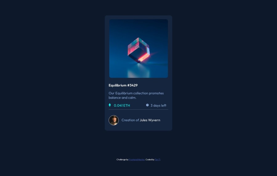
Design comparison
Solution retrospective
Hi everyone. I haven't figured our how to bring the light blue hover overlay to the front of the card. I tried using z-index but couldn't figure that out. What is preventing the hover effect? Once I get that figured out, I will fix the opacity and make other changes as needed.
I appreciate any help or other feedback. Thank you!
Community feedback
- @itushPosted over 1 year ago
Congratulations on completing the challenge! š
Thank you very much for sharing your issue with the project.
- In my solution for this project I created the overlay effect by using the :hover pseudo-class on the iconview class.
HTML
<div class="card"> <div class="himg"> <img id="eqimg" src="./images/image-equilibrium.jpg" alt=""> <div class="iconview"> <img id="icnimg" src="./images/icon-view.svg" alt=""> </div> </div>
CSS
.himg{position: relative;} .iconview{position: absolute; top: 0; padding: 40.5%; background: var(--Cyan); border-radius: 10px; z-index: 1; opacity: 0; } .iconview:hover{ opacity: .5; cursor: pointer; }
-
The iconview class has a position property set to absolute, which allows it to be positioned on top of the image. It also has a opacity property set to 0, which makes it invisible by default. When the user hovers over the image, the :hover pseudo-class is triggered and the opacity property of the iconview class is changed to 0.5, making the overlay partially visible.
-
You may go through the entire source code
In my projects:
- I always start with mobile-first workflow.
- I use at least one main element for a page (entire content goes into the main, if I'm not using header & footer), and avoid divs as much as possible and use section and article element wherever I can.
<body> <main> All content </main> </body>
-
I Use relative units as much as possible and avoid absolute units whenever possible.
-
If you are someone who is just starting out with front-end development, I strongly suggest starting with the QR code component project. Also in the challenges page you may filter by (Newbie, HTML&CSS) sort by (easier first) to select projects that will help you solidify your foundation. Also, to avoid any knowledge gap first solidify HTML, CSS, JS fundamentals and then move on to any framework or library.
-
I remember when I started out, I made countless mistakes and spent long hours searching for solutions. But hey, you don't need to go through the same struggles! š To help you shorten the learning curve, I recommend going through the following articles. They contain valuable insights that can make your journey smoother:
šš 12 important CSS topics where I discuss about css position, z-index, box-model, flexbox, grid, media queries, mobile-first workflow, best practices etc. in a simple way.
šš 11 important HTML topics where I discuss about my thought process and approach to convert a design/mock-up to HTML along with other topics.
I hope you find these resources helpful in your coding adventures! š¤
I'm eagerly looking forward to seeing the amazing projects you'll create in the future! šš»
Keep up the fantastic work and happy hacking! šŖāØ
0
Please log in to post a comment
Log in with GitHubJoin our Discord community
Join thousands of Frontend Mentor community members taking the challenges, sharing resources, helping each other, and chatting about all things front-end!
Join our Discord