Design comparison
Solution retrospective
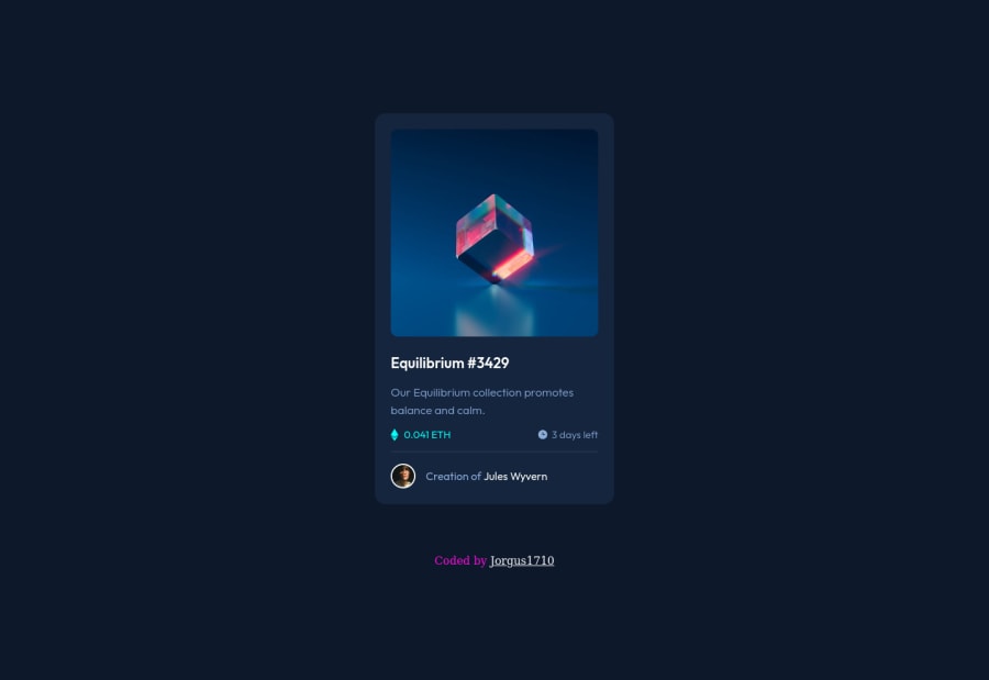
A fun project that really made me explore in depth what exactly pseudo classes are (::before & ::after), as well it gave insight on how to use position: relative and absolute. I'm not going to lie, achieving the hover state on the main image was far more difficult than I had initially anticipated. It took me 2 days of trial & error, as well as learning to finally achieve the desired result.
Question(s):
-
When hovering over the main image, you can see the translucent cyan overlay goes a bit beyond the lower border of the actual image or the image wrapper. Its not by much, and certainly I can get away with this result as is - but I'd love to have insight as to why this is happening.
-
For the hover states on the main image I used position absolute & relative to center the "eye" SVG icon to its parent wrapper. As well for the cyan overlay which is translucent, I used an empty div in the parent container of the main image, to which I then applied a ::before pseudoclass. If anyone has an alternative or ideally more simplified method of achieving these hover affects please let me know.
Community feedback
- @vanzasetiaPosted over 2 years ago
Hello, George! 👋
Nice work on this challenge! 🙌 Your solution is responsive and looks great! 👍
Regarding your questions, I would recommend re-creating the overlay using pure CSS by following these steps.
- First, wrap the Equilibrium with an anchor tag. It's important for any interactive elements to be wrapped by interactive elements (
a,button, and a lot more). - Second, the alternative text of the Equilibrium is now a text content or label for the anchor tag. So, I suggest an alternative text that tells the user what is going to happen after the user clicks the image. I'm going to tell the user that it is going to allow the user to view the image so, the alternative text would be View Equilibrium and the
hrefis pointing to the image file. - Third, remove the overlay div and the
imgtag for the eye icon. - Finally, use the pseudo-element and background properties to show both the eye icon and the cyan background when the image gets hovered.
I know that this is not answering the questions however by doing this, the HTML looks a bit cleaner and it still has the same result but with less markup. 😉
Hope this helps. Keep up the great work! 👍
Marked as helpful1 - First, wrap the Equilibrium with an anchor tag. It's important for any interactive elements to be wrapped by interactive elements (
- @zeerobitPosted over 2 years ago
Great job completing this challenge.
1- in regards to your first question you can fix that by adding
display: block;on the .main-img class. You should use max-width and not width on images, so it should bemax-width: 100%;2- Another way you can center the icon-view is to remove the pseudo element completely, add the icon-view image inside of the .overlay div then use position absolute to move it on top of the .img-wrapper. use flexbox to center the icon-view . Remove the properties you have under .hover-img and simply add
display: block;max-width: 100%;3- The images are supposed to be interactive thus you should wrap them in anchor tags.
4- no need to add alt description for the 2 images since they're decorative images, add aria-hidden:"true" to hide them from assistive technology
5- Use rem instead of px since it's not scalable
6- The creator section could be wrapped in figure and figcaption for better semantics
7- the .attribution should be wrapped in footer
Hope these help, if you have questions feel free to ask. Happy coding !!!
Marked as helpful0
Please log in to post a comment
Log in with GitHubJoin our Discord community
Join thousands of Frontend Mentor community members taking the challenges, sharing resources, helping each other, and chatting about all things front-end!
Join our Discord
