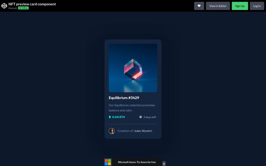
Design comparison
Solution retrospective
I used absolute positioning with fade-in opacity when hovering over the image. Is this the most efficient way to do it? I had to fix the size of the overlay manually, which is probably not the best way to do it. I'd love some pointers on making this more responsive :)
Community feedback
- @PhoenixDev22Posted over 2 years ago
Hello Kitty10206,
Congratulation on completing this challenge. Excellent work! I have few suggestions regarding your solution, if you don't mind:
HTML
you should use
<main>
to wrap the NFT card. HTML5 landmark elements are used to improve navigation experience on your site for users of assistive technology.-
Since there's a :hover state on the image and means it's interactive, So there should be an interactive element around it. When you create a component that could be interacted with a user , always remember to include interactive elements like(button, textarea,input, ..) for this imagine what would happen when you click on the image, there are two possible ways:
1: If clicking the image would show a popup where the user can see the full NFT, here you use<button>
. 2:If clicking the image would navigate the user to another page to see the NFT, here you can use<a>
. For the same reason , you can use<a>
to wrapEquilibrium #3429
andJules Wyvern
. -
The link wrapping the equilibrium image should either have
Sr-only
text, anaria-label
. -
In (
icon-view, icon-ethereum, icon-clock
)as they are decorative svg’s , you should setaria-hidden=”true”
andfocusable=”false”
to be ignored by screen readers. -
If you wish to draw a horizontal line, you should do so using appropriate CSS. You may remove the
<hr>
, you can useborder-top:
to the avatar's part. -
To use more semantic tags , you may use
<figure>
and<figcaption>
for the avatar's part. -
Images must have alt attribute. You can use the creator's name
Jules Wyvern
for the alternate text. Read more how to write an alt text -
For middle part of the card
"numbers-footer"
, you can use an unordered list<ul>
, in each<li>
there should be<svg>
and<p>
that way you can align them centrally.
There are so many ways to do the hover effect on the image, The one I would use is pseudo elements
::before, ::after
. You can use pseudo-elements to change the teal background color to hsla. Then the opacity can be changed from 0 to 1 on the pseudo element on the hover. Also using pseudo elements makes your HTML more cleaner as there's need for extra clutter in the HTML . The icon-view doesn’t really need to be in the HTML. You can use CSS for it.- Consider using rem and em units as they are flexible, specially for font size If your web content font sizes are set in absolute units, such as pixels, the user will not be able to re-size the text or control the font size based on their needs. Relative units “stretch” according to the screen size and/or user’s preferred font size, and work on a large range of devices.
- Really important to keep css specificity as low/flat as possible. It’s not recommended use the id's to target the DOM elements for styling purposes , using ID's creates problem due to the specificity , better to use class so that it could be more manageable and reusable.
- Remember a css reset on every project. That will do things like set the images to display block and make all browsers display elements the same.
Last , It's a good practice to have the styles in separate file . The reason for this is that the CSS stylesheet exists for the purpose of defining the presentation style of the document. The HTML file exists to define the structure and content of the document also it's useful, if multiple pages on your site have the same look .
Overall, Your solution is good. Hopefully this feedback helps.
Marked as helpful1@Kitty10206Posted over 2 years ago@PhoenixDev22 Thank you so much! I missed a huge amount this time, my bad. I really appreciate the full answer you gave, its super helpful! I'd like to submit an updated version with all of this fixed. Do I have to restart the challenge? If so, can I resubmit my original answer with the improvements or should I start from scratch?
1@PhoenixDev22Posted over 2 years ago@Kitty10206
You’re welcome and glad it was helpful.
You don’t need to resubmit the solution . Just push the improvements in GitHub repo, the solution is modified, then any one will see the recents updates. I suggest to read FAQ in frontend mentor to find more about how to update and delete a solution … Hopefully this helps.
Marked as helpful1 -
Please log in to post a comment
Log in with GitHubJoin our Discord community
Join thousands of Frontend Mentor community members taking the challenges, sharing resources, helping each other, and chatting about all things front-end!
Join our Discord