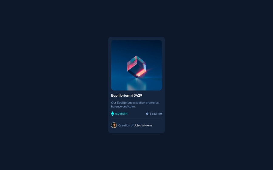
Design comparison
Solution retrospective
Please let me know about any improvements! :)
Community feedback
- @correlucasPosted about 2 years ago
👾Hello Vanessa, congratulations on completing this challenge!
Nice code and nice solution! You did a good job here putting everything together. I’ve some suggestions for you:
1.Add transitions to make the interaction smoother while the element gets hovered, you can use a value like
transition: all ease-in 0.5s.2.Make your solution SUPER RESPONSIVE, creating a media query to save space in the
pricing sectionto make each information in a different row. Here’s the code for this media query.@media (max-width: 350px) { .info { display: flex; justify-content: space-between; padding-bottom: 1em; border-bottom: 1px solid var(--line-color); font-size: 0.875rem; flex-direction: column; align-items: center; } }✌️ I hope this helps you and happy coding!
Marked as helpful0@VanessaAzPosted about 2 years ago@correlucas the 1st suggestion is already done :) I will definitely work on the 2nd. Thank you!
1
Please log in to post a comment
Log in with GitHubJoin our Discord community
Join thousands of Frontend Mentor community members taking the challenges, sharing resources, helping each other, and chatting about all things front-end!
Join our Discord
