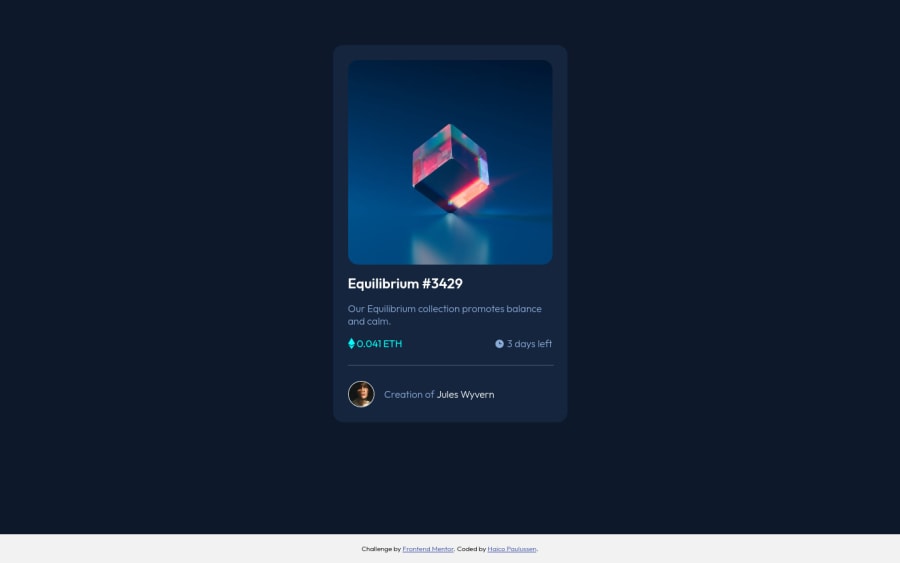
Design comparison
Community feedback
- @markteekmanPosted about 3 years ago
Hey Haico,
Great work once more on this challenge! You can definitely see your CSS Grid skills improve :) I like how you kept the HTML very minimal and used the power of Grid to handle the structure of the layout.
Some small improvements:
- On smaller screens (phone for example) the attribution footer lays over your card because you've used
position: fixed. You could try something like a sticky footer solution, where it's still at the bottom on large screen sizes but stays below the main content on small screen sizes. - When viewing the component on a small screen size the card overflows the viewport. This is because you've set a fixed
width: 375pxon themainelement. Try to avoid setting it explicitly as much as possible. Settingmax-width: 375pxsolves this. - Try to include a CSS reset in your project, not including one can often lead to differences between browsers. A good example is trying to implement the sticky footer I mentioned. You can see in Firefox that the body has some margin which results in the footer overflowing the viewport because of the
width: 100vwthe footer has. There are many options, a simple one is all you need. - When using
alt=""attributes on images, check whether is makes sense to put it there. For example, you havealt="image of Jules Wyvern"on the avatar, followed by the text 'Creation of Jules Wyvern'. A screen reader would now read 'image of Jules Wyvern Creation of Jules Wyvern'. So here, it's better to have an emptyalt=""tag. If the avatar image wasn't accompanied by any text it would make sense to set the alt tag to describe it to the user. - Another accessibility concern is that your anchor links aren't distinguished in this component. 'Equilibrium #3429' and 'Jules Wyvern' are links, but this is not visually notable. Consider adding an underline to them.
All in all, it's a great looking component!
Happy coding :)
Marked as helpful2@Haico-PaulussenPosted about 3 years ago@markteekman,
Thank you for your time to give such elaborate feedback on my challenge. I have looked at your suggested improvements and changed a bunch.
- My footer is now sticky, now it doesn't overlay the main content on a small viewport anymore.
- I changed the
widthtomax-width, that was a sloppy mistake from me ;) - For the margin on the body I added
margin: 0, is that what you meant? - I solved the a11y problems, I didn't take them enough into account.
Thanks again for the feedback.
1@markteekmanPosted about 3 years ago@Haico-Paulussen great work! For the sticky footer, don't forget to set these to make it stick to the bottom of the page:
html, body { height: 100%;}And yes,
margin: 0on the body would suffice in this case! You can then consider adding a CSS reset file to your future projects.Also, there's no such thing as sloppiness, it's all about learning and trying to get better so keep it up!
1 - On smaller screens (phone for example) the attribution footer lays over your card because you've used
- @markteekmanPosted about 3 years ago
Haico, just figured I forgot one addition, you can add
cursor: pointerto your.header:hover .view-containerclass to add that extra level of interaction taken from the design :)1
Please log in to post a comment
Log in with GitHubJoin our Discord community
Join thousands of Frontend Mentor community members taking the challenges, sharing resources, helping each other, and chatting about all things front-end!
Join our Discord
