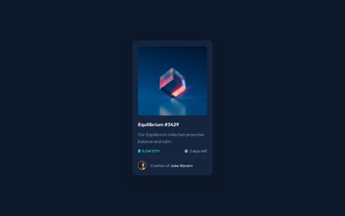
nft card, vanilla css

Solution retrospective
Hey guys,
I found this was an overall pretty easy challenge, I completed it in an hour or two. Most of this time I've spent on trying to figure out the background shadows (ended up using a mix of box-shadow and pseudo-element) and pondering what would be the best solution for the image overlay from an accessibility point of view. I went with having a link and an image side by side in a container (was wondering if it would be a better solution to wrap the image inside the link?) and used ::before for the overlay. I'm not sure if this is the prettiest solution, as I had to use fixed width&height to achieve what I wanted. If anyone can recommend something nicer, I'd really appreciate it!
If you have any feedback on other parts of my solution, I'd be very happy to hear that as well!
Have a great day everyone!
Please log in to post a comment
Log in with GitHubCommunity feedback
No feedback yet. Be the first to give feedback on Fluffy Kas's solution.
Join our Discord community
Join thousands of Frontend Mentor community members taking the challenges, sharing resources, helping each other, and chatting about all things front-end!
Join our Discord