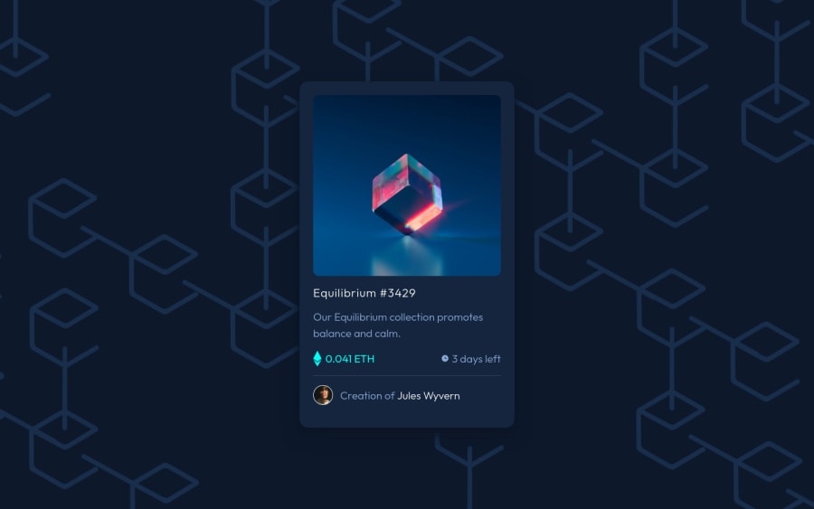
Design comparison
Solution retrospective
This is my first time using sass for a project. Definitely see the benefits. Did add some extra hover animations. If anyone has a solution for the blurry text on scale for chrome I'm all ears I've tried multiple things and nothing seems to work. I welcome any feed.
Community feedback
- @AdrianoEscarabotePosted over 2 years ago
Hi @hyrongennike, how are you?
I really liked the result of your project, but I have some tips that I think you will like.
To further improve the responsiveness of the project, you can do the following:
img { height: 100%; }to prevent the card from growing at lower resolutions.
The rest is very good, you did a really great job in this challenge, this background image and the card animations were very good!
Hope it helps... 👍
2 - @EmmiecodesPosted over 2 years ago
Hi Hyron, you helped me out a few days ago and I ran against a problem with my NFT card (got the svg image on top showing yesterday but changed something I can't remember so it doesn't anymore) so I came lurking at other peoples codes. Now I saw you also had the problem with the overflow which took me a while to fix too. (not yet updated on github) When you set the line-height to 0% on the image container the overflow will be fixed without having to set a max-height and overflow: hidden.
0
Please log in to post a comment
Log in with GitHubJoin our Discord community
Join thousands of Frontend Mentor community members taking the challenges, sharing resources, helping each other, and chatting about all things front-end!
Join our Discord
