Not Found
Not Found
Not Found
Not Found
Not Found
Not Found
Not Found
Not Found
Not Found
Not Found
Not Found
Not Found
Not Found
Not Found
Not Found
Not Found
Not Found
Not Found
Not Found
Not Found

Submitted

NFT Card using Reactjs and Styled Components

rebecca 60

@rebeccaaaaaaaaaaa

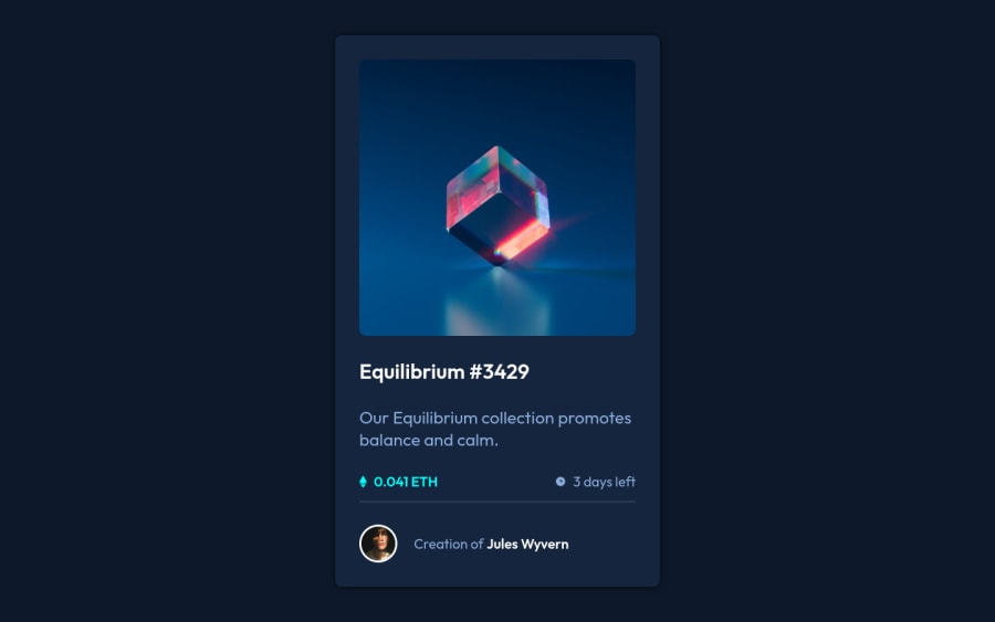
Desktop design screenshot for the NFT preview card component coding challenge

This is a solution for...

  • HTML
  • CSS
1newbie
View challenge

Design comparison


SolutionDesign

Solution retrospective


How are you guys? Here's my solution to the challenge, I'm a beginner but I'm always looking to improve and study. I've been using this type of challenge to apply what I've been learning, any improvement opinion is welcome!

Community feedback

@pikapikamart

Posted

Hey, great work on this one. Right now, the overall layout looks huge both desktop and mobile state.

Krisztina Kovari already gave really great feedback on this and I second to all her feedback. Here are some suggestions for the site as well:

  • Don't use width: 100vw since this will only add a horizontal scrollbar at the bottom, since this value does not account the vertical scrollbar's width.
  • Avoid using height: 100vh on a large container like the div that holds the nft-card as this makes the element's height capped based on the viewport/screen's height. Instead use min-height: 100vh so that the element will expand if it needs to.
  • Always have a main element to wrap the main content of the site. For this use main tag on the div after the #root selector. This way, your content will be inside a main landmark.
  • Like what Krisztina had said, the :hover state for the preview image is not created. Just a quick suggestion, if you are going to implement the :hover state make sure that you are going to use an interactive element that could be nesting the img. Because as you may remember, an img tag is not an interactive element. You could use either a tag or button, depending on whatever you think clicking the image would do.
  • For the nft image, you could use the nft name as the alt value since it is already present. You could use something like alt="nft Equilibrium #3429".
  • For the nft name, since it is an interactive component, use an a tag inside the h1 so that it will be interacted with.
  • For the eth-icon and the clock-icon, you could use alt="" and aria-hidden="true" on both of it since on this one, it is acting as decorative images. Decorative images are just images that doesn't contribute to the overall content of the site.
  • Also, when using img tag, you don't need to add words that relates to "graphic" such as "icon" and others, since img is already an image so no need to describe it as one.
  • For the person's img, you could use the person's name as well since it makes sense to do so since on this layout, it is showing the creator of the nft.
  • Change the span inside the person's name to use a tag so that it will be interactive.
  • Lastly, just re-styling the whole card or the size of it so that it will closely match the design's dimension.

Aside from those, great job again on this one.

Marked as helpful

2

rebecca 60

@rebeccaaaaaaaaaaa

Posted

@pikapikamart Thanks Raymart for the comment, it was correct all these points and I'll be back soon with the most updated version of the project.

1

@krystonen

Posted

Hi Rebecca,

Nice work! I like that you used React and styled components. I have a few comments on your solution (I worked on it myself recently).

  • Check design for the hover state, I found it an interesting challenge in itself (tip: use pseudo elements.)
  • Try to resolve accessibility issues flagged by the report
  • Can you use more meaningful semantic HTML for your markup?
  • Would you consider using css variables styled components ( I actually looked this up for myself as well: https://www.joshwcomeau.com/css/css-variables-for-react-devs/ )
  • Responsiveness: On mobile the card doesn't appear fully. On desktop the card seems larger than on the design. My tips: try using relative units instead of fixed pixels where it makes sense. add media query if relative units don't do the job.

Marked as helpful

2

rebecca 60

@rebeccaaaaaaaaaaa

Posted

@krystonen Krisztina, Thanks for the tips, I'll fix it on the project soon. Thanks again

0

Please log in to post a comment

Log in with GitHub
Discord logo

Join our Discord community

Join thousands of Frontend Mentor community members taking the challenges, sharing resources, helping each other, and chatting about all things front-end!

Join our Discord