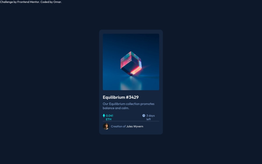
Design comparison
SolutionDesign
Community feedback
- @denieldenPosted over 2 years ago
Hi Omar, I took some time to look at your solution and you did a great job!
Also I have some tips for improving your code:
- add descriptive text in the
altattribute of the image - centering an element with
absolutepositioning is now deprecated, it uses modern css likeflexbox or grid - try to use flexbox to the body for center the card. Read here -> best flex guide
- after, add
min-height: 100vhto body because Flexbox aligns child items to the size of the parent container - try to add a little
transitionon the element with hover effect - instead of using
pxtry to use relative units of measurement -> read here
Overall you did well 😉
Hope this help and happy coding!
Marked as helpful0 - add descriptive text in the
Please log in to post a comment
Log in with GitHubJoin our Discord community
Join thousands of Frontend Mentor community members taking the challenges, sharing resources, helping each other, and chatting about all things front-end!
Join our Discord
