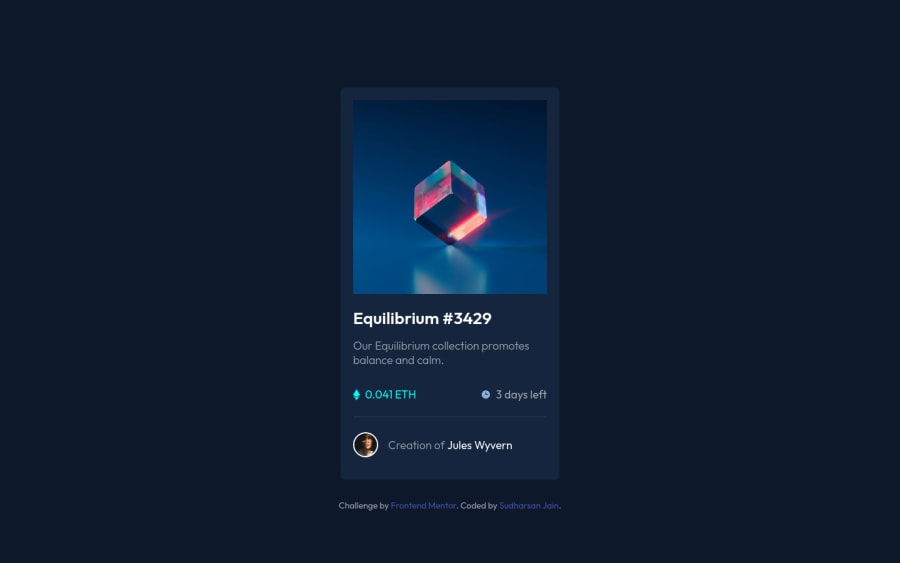
Design comparison
SolutionDesign
Community feedback
- @denieldenPosted about 3 years ago
Hi Sudarsh, I took some time to look at your solution and you did a great job!
Also I have some tips for improving your code:
- add
maintag and wrap the card for Accessibility - To make it look as close to the design as possible add
border-radius: 1rem; and overflow: hidden;to#thumbnailid - remove all
marginfromcardclass - remove all
paddingfrom body - try to use flexbox to the body for center the card. Read here -> best flex guide
- after add
min-heigth: 100vhto body because Flexbox aligns to the size of the parent container - try to add a little
transitionon the element with hover effect
Overall you did well :)
Hope this help and happy coding!
Marked as helpful1 - add
- @imhayatunnabiPosted about 3 years ago
nicely done
0
Please log in to post a comment
Log in with GitHubJoin our Discord community
Join thousands of Frontend Mentor community members taking the challenges, sharing resources, helping each other, and chatting about all things front-end!
Join our Discord
