Design comparison
SolutionDesign
Solution retrospective
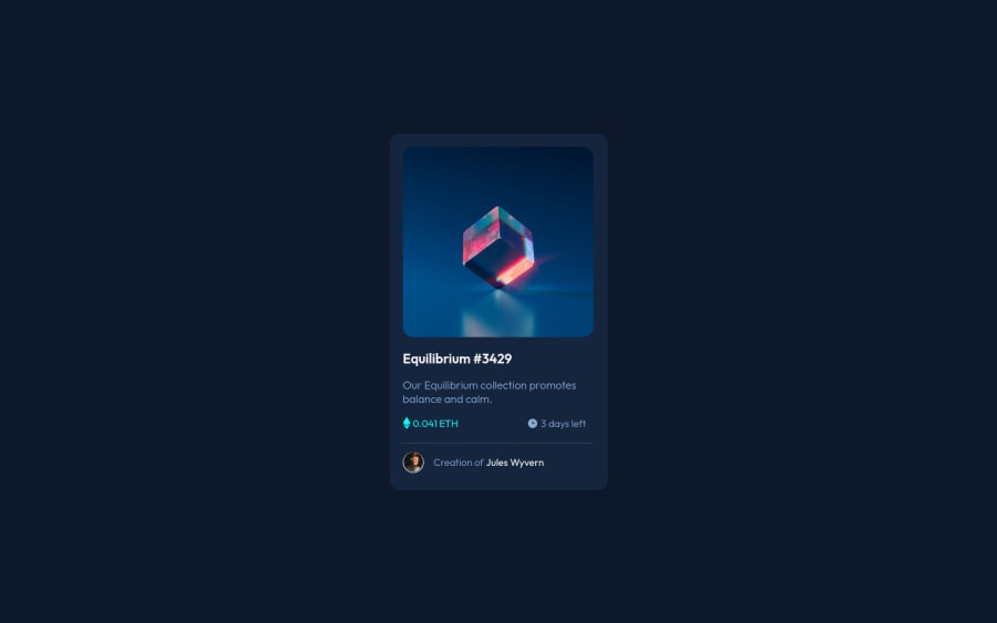
I tried using better CSS units for my elements. Please let me know if I used any units wrongly. I also struggled with the hover overlay effect on the NFT image. I had to copy from the internet but I'm wondering how this manages to work. If you have any other feedback, please feel free to comment below. Thanks!
Community feedback
Please log in to post a comment
Log in with GitHubJoin our Discord community
Join thousands of Frontend Mentor community members taking the challenges, sharing resources, helping each other, and chatting about all things front-end!
Join our Discord
