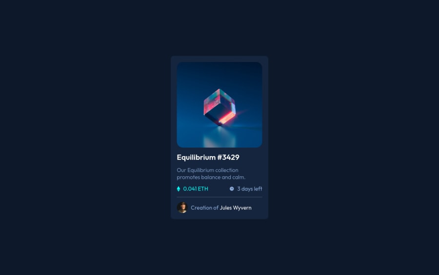
Design comparison
Solution retrospective
This was a relatively easy project, any suggestions to improve are welcome.
Community feedback
- @AdarshRai0Posted over 2 years ago
Browser has a default style sheet called User Agent Stylesheet which adds margin to headings and paragraphs and applies font properties to all elements.
I usually reset all the styles and I start from scratch.
Here is my styles.css
:root{
  /* colors and fonts */
  --font: "Montserrat", sans-serif;
  --white: #ffffff;
}

*{
  margin: 0;
  padding: 0;
  box-sizing: border-box;
}

html{
  font-size: 62.5%;
}

html, body{
  height: 100%;
}

body{
  width: 100%;
  font-family: var(--font);
}

/* Other rule-sets */
0 - @AdarshRai0Posted over 2 years ago
Hi Bismeet congratulations on your new challenge!
I took a look at your code and I have some tips for you.
The ripple background was missing, in this case it is better to import it in the body with background-image and put a media query to change mobile / desktop or use the <picture> tag in the HTML.
I saw that you used id as a selector, but a good practice would be to handle the entire design with classes and leave the id for forms and Javascript.
Congratulations, since your first project, your challenges have gotten better and better.
0@BismeetSinghPosted over 2 years ago@AdarshRai0 Hi, I dont see where have I used id as a selector. Infact, my current code doesnt have a single id. Your challenges have gotten better and better -> Looks like I am being spied :)
0
Please log in to post a comment
Log in with GitHubJoin our Discord community
Join thousands of Frontend Mentor community members taking the challenges, sharing resources, helping each other, and chatting about all things front-end!
Join our Discord
