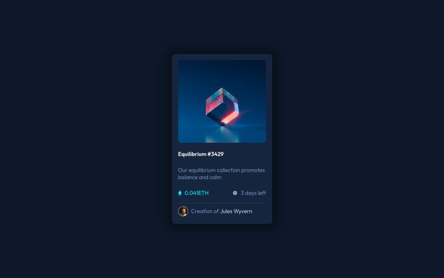
Design comparison
Community feedback
- @PhoenixDev22Posted almost 3 years ago
Hello @GrischK ,
I have some suggestions regarding your solution:
to tackle the accessibility issues:
-
Document should have one main landmark . So wrap the body content by <
main>. -
Page should contain a level-one heading
<h1>.So you can use<h1>to wrapEquilibrium #3429.(as it should be wrapped by a heading ) -
Anything with a hover style in a design means it's interactive. you need to add an interactive element around the image and
Equilibrium #3429andJules Wyvern. -
Add hover effect on the image . THere are so many ways to do this .you can check my solution
-
For any decorative images, each img tag should have empty
alt=""andaria-hidden="true"attributes to make all web assistive technologies such as screen reader ignore those images inalt="blue triangle", alt="blue clock" -
the link should be wrapping the original image and either have
Sr-onlytext, anaria-labeloralttext that says where that link takes you. -
The avatar's alt text shouldn't be
alt="man face". You can useJules Wyvernas an alt text. -
No need for absolute position to center the card on th emiddle of the page , you can use flexbox properties and
min-height: 100vh;to thebody.
body { background-color: hsl(217, 54%, 11%); display: flex; align-items: center; justify-content: center; min-height: 100vh; }- Some suggestions to improve the code
.container { height: 550px; It's not a good practice to set the height of the elements (except some few like buttons, ..). let the content define the height width: 325px;/* an explicit width is not a good way . Remove the width from the card component and change it to ``max width`` instead. That will let it shrink a little when it needs to */ background-color: hsl(216, 50%, 16%); /* position: absolute; */ remove these /* left: 50%; */ /* top: 50%; */ /* transform: translate(-50%, -50%); */ box-shadow: 0px 0px 30px 20px hsl(216deg 53% 7%); border-radius: 10px; display: flex; flex-direction: column; }-
Never use
pxfor font-size. -
You should use
emandremunits .Bothemandremare flexible, Usingpxwon't allow the user to control the font size based on their needs.
Hopefully this feedback helps.
0 -
Please log in to post a comment
Log in with GitHubJoin our Discord community
Join thousands of Frontend Mentor community members taking the challenges, sharing resources, helping each other, and chatting about all things front-end!
Join our Discord
