Design comparison
Community feedback
- @RioCantrePosted about 3 years ago
Hello there! Nice job in completing this project. Regarding your solution, I would like to recommend the following for you…
- For the HTML structures, everything is fine except for this one...
<footer class="nft-footer">
      <img
	class="author-avatar"
	src="./images/image-avatar.png"
	alt="Small image of NFT creator"
      />
      <span class="author">
		Creation of <span class="highlight">Jules Wyvern</span>
      </span>
</footer>

* Wrap it with <div> instead
For any doubt, refer it with this one Semantics
- Add the
background-color: hsl(217, 54%, 11%);in thebodyrule set
Above all, the project is done well. Keep up the good work and Hope this is helpful!
Marked as helpful0 - @PhoenixDev22Posted about 3 years ago
Hello @j-hutchison,
I have some suggestions regarding your solution:
-
First of all, I see you are trying to use landmark , but you are totally misused them.
-
There should be two landmark components as children of the body element - a
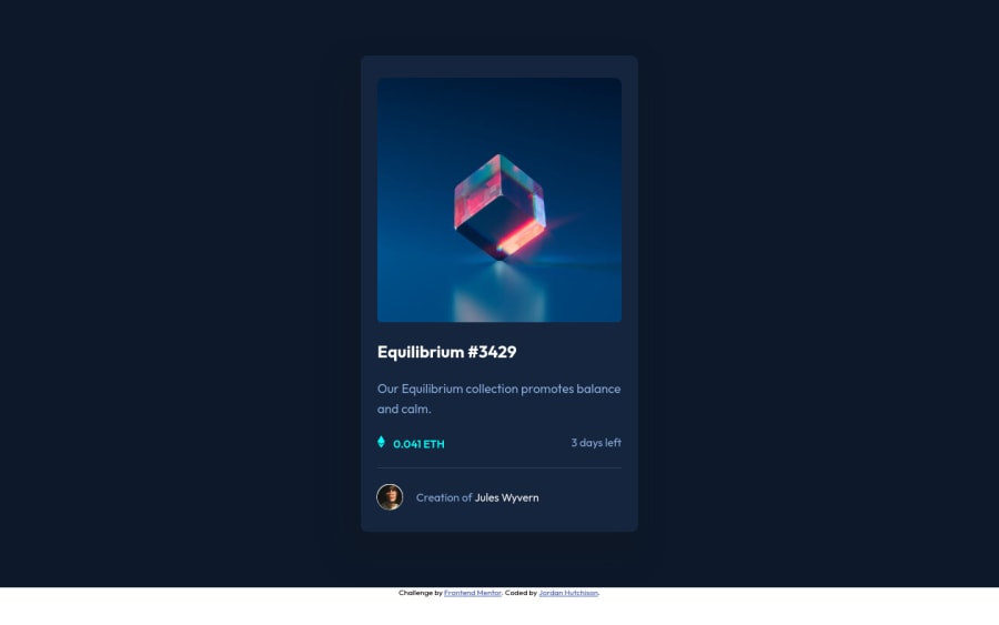
main(which will be the NFT card ) and afooter(which will be the attribution).<Footer>should be in the<main >.- Anything with a hover style in a design means it's interactive. you need to add an interactive element
<a>around the imageEquilibrium #3429, Jules Wyvern.
- Anything with a hover style in a design means it's interactive. you need to add an interactive element
-
Images must have alt text.
-
For any decorative images, each img tag should have empty
alt=""andaria-hidden="true"attributes to make all web assistive technologies such as screen reader ignore those images in(icon-view, icon-ethereum, icon-clock). -
The avatar 's alt shouldn't be
"empty ", you can setJules Wyvernto it. And for the equilibrium image should be descriptive. -
the
icon-viewdoesn't really need to be in the html, you could do it with css. If you want it to stay in html it needs to be aria-hidden or role presentation with empty alt. -
I would leave the equilibrium main img in html and use pseudo-elements . You either have to change the teal bg color to a hsla. Then opacity can be changed from 0 to 1 on the pseudo on hover.
-
Alt text for the profile image shouldn't be
empty .Read more how to write an alt text -
the link should be wrapping the main image and either have
Sr-onlytext, anaria-labeloralttext that says where that link takes you. -
You can use an unordered list
<ul>to wrapclass="section-price"and in each<li>, there would be<img >and<p>. Don't use span's for meaningful content .
<ul class="">
    <li>
      <img src="./images/icon-ethereum.svg" class="currency-symbol" alt="" aria-hidden="true">
      <p  class="price">0.041 ETH</p>
    </li >
    <li >
      <img src="./images/icon-clock.svg" alt="" aria-hidden ="true">/*you forgot this one.*/
      <p  class="duration">3 days left</p>
    </li>
</ul>
And for this part,
<div  class="nft-footer">
    <img  class="author-avatar" src="./images/image-avatar.png"alt="Jules Wyvern"/>
    <p class="author">Creation of <a href="#"  class="highlight">Jules Wyvern</a ></p>
</div>
Otherwise you can use
<figure >or<figcaption>for this part.- To center the card on the middle of the page , you can use the flexbox properties and
min-height: 100vhfor the<body>like this:
body{
display:flex;
align-items: center;
justify-content: center;
width: 100%;
min-height: 100vh;
You might have a look at my solution , to see how I did the hover effect on the image , it might my helps. Overall, your solution is good, Hopefully this feedback helps.
0 -
- @DrMESAZIMPosted about 3 years ago
hi @j-hutchison. well done .I noticed that you used both CSS Grid and Flexbox , I would have preferred you choose one between Grid and Flex. Its advantageous in that way it make you a Pro in your preferred CSS framework.
0
Please log in to post a comment
Log in with GitHubJoin our Discord community
Join thousands of Frontend Mentor community members taking the challenges, sharing resources, helping each other, and chatting about all things front-end!
Join our Discord
