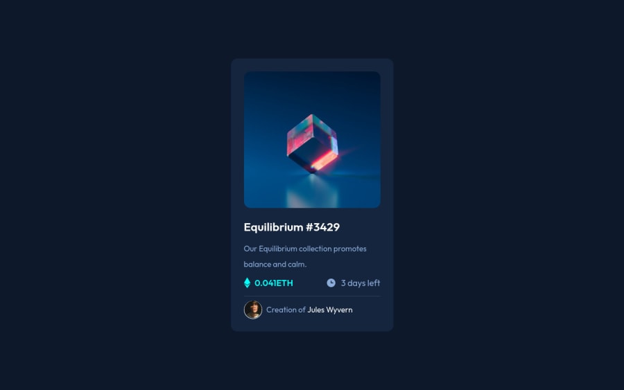
Design comparison
Solution retrospective
I am really confused about the Containers, should I create containers for each of my page elements? , and what is the best way to name them?.
Community feedback
- @RioCantrePosted over 2 years ago
Hello there! Great work with this one. Regarding the solution you submitted, I think you should also take notes of the following…
- Instead of
div
, alternatively wrap the whole content with other semantic tags, for HTML structures, refer it with this one Semantics - Other way is to refactor the structure into...
<-- wrap the content with only main tag --> <main class="container"> <div class="img"> <div class="layer"> </div> </div> <-- this part with section --> <section> <h2> Equilibrium #3429</h2> <p class="description">Our Equilibrium collection promotes balance and calm.</p> <div class="details"> <div class="eq flex"> <img src="images/icon-ethereum.svg" alt=""> <div class="eq-comment">0.041ETH</div> </div> <div class="time flex"> <img src="images/icon-clock.svg" alt=""> <div class="time-comment">3 days left</div> </div> </div> </section> <-- this part with footer if there is no attribution --> <footer class="footer flex"> <div class="creation"> </div> </footer> </main>
- Include description with the
alt
in image tags. Like this one<img src="images/image-equilibrium.jpg" alt="" class="main-img">
Above all, The design looks good. Keep it up!
Marked as helpful1@IbrahimMhSaeedPosted over 2 years ago@RioCantre Thanks, That was confusing me a lot. I really appreciate it!
0 - Instead of
- @GitHub-dev12345Posted over 2 years ago
Congratulation to complete your challenge 😊🚀 Use this code to increase the size of card : 😊 used this CSS Property in your card to increase and decrease the size of card:
1.In Card design CSS Code Used this:
transform : scale(0.8); this property decrease the size of card. 😉
large size for increase the number of scale & small size for decrease the number of scale
I hope you find this helpful
1@IbrahimMhSaeedPosted over 2 years ago@GitHub-dev12345 when I look at it now it seems a little bit larger, using ur way will save so much time Thanks!
0
Please log in to post a comment
Log in with GitHubJoin our Discord community
Join thousands of Frontend Mentor community members taking the challenges, sharing resources, helping each other, and chatting about all things front-end!
Join our Discord