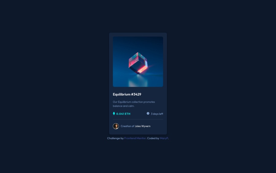
nft card using BEM,pseudo elements and overlay effect
Design comparison
Solution retrospective
Hello coders! I'm very proud of this one. I kept practising BEM, and also started using pseudo elements `::after which I havent used and wanted to learn more about it. Plus the overlay effect was tricky but I got it! I'm open for all the feedback and ways on how I can improve my code!
Community feedback
- @vanzasetiaPosted almost 3 years ago
š Hi there!
š Congratulations on finishing this challenge! It's good to know that you have learned something when you were doing this challenge. I have some feedback on this solution:
- Accessibility
- š Well done! All the page content lives inside the correct landmarks!
- On this challenge, use interactive elements (
a
) for any elements that have:hover
or:active
states. - Create a custom
:focus-visible
styling to any interactive elements (button
, links,input
,textarea
). This will make the users can navigate this website using keyboard (by usingTab
key) easily. - About the overlay image, you can pseudo-elements and
background
properties to create the overlay. If you want to know how to do it, you can check my solution and read theREADME
to get some juicy information about it. - Wrapping the
h1
with anchor tag can be potentially invalid HTML. I would recommend making theh1
wrap the anchor tag instead.
<h1 class="card__title"> <a href="/" class="card__link">Equilibrium #3429</a> </h1>
- Also, I would recommend always having a value inside the
href
attribute. This will make sure that the functionality of the link will always work. In this case, you can have a/
(forward slash) as the value. It will not go anywhere. <h2 class="card__eth card--icon">0.041 ETH</h2>
should be ah2
. It should be a paragraph. You can think of a heading like a title on a document.
Example: How to use a computer (h1) How to set up a computer (h2)
- For the avatar image, you can use the creator's name as the alternative text.
- Use
rem
or sometimesem
unit instead ofpx
. Usingpx
will not allow the users to control the size of the page based on their needs. - Styling
- š Good job on using CSS reset!
- To make the card perfectly in the middle of the page, you can make the
body
element as a flexbox container.
/** * 1. Make the card vertically center and * allow the body element to grow if needed */ body { display: flex; align-items: center; justify-content: center; min-height: 100vh; /* 1 */ }
- Remove the
overflow: hidden
from thebody
element. On mobile landscape view, the user can't scroll to see the rest of the page content. - For the line, I would recommend using CSS
border
property.
That's it! Hopefully, this is helpful!
Marked as helpful1@JanselinPosted almost 3 years ago@vanzasetia Wow! thanks a lot for your feedback, that was really helpful! i will fix everything you have mentioned :) I appreciate your time and tips!
1 - Accessibility
Please log in to post a comment
Log in with GitHubJoin our Discord community
Join thousands of Frontend Mentor community members taking the challenges, sharing resources, helping each other, and chatting about all things front-end!
Join our Discord