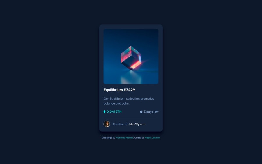
Design comparison
SolutionDesign
Solution retrospective
What are you most proud of, and what would you do differently next time?
I tried to approach the hovering effect using transition in opacity instead of just creating a filter. It was a good way to learn a different way to do the same thing.
What challenges did you encounter, and how did you overcome them?Handling similar challenges with different approaches was my biggest challenge in this one.
What specific areas of your project would you like help with?I'm open to feedback!
Community feedback
Please log in to post a comment
Log in with GitHubJoin our Discord community
Join thousands of Frontend Mentor community members taking the challenges, sharing resources, helping each other, and chatting about all things front-end!
Join our Discord
