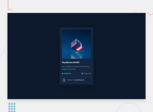
Design comparison
Solution retrospective
Hello everybody! It's the first approach a solution. I've to improve the preview animation and fix another little details but for now I like it. Feel free to give any feedback and have a nice day!
Community feedback
- @macdeeshPosted over 2 years ago
Hello Emiliano,
This is how you can improve your code :
1- What do you expect when you see a hover effect? You know something is clickable, right? That means it's an interactive element. Every place you see a hover style, you need to include an interactive element, like an anchor tag or button. That is essential to fix.
2- I would do the hover effect on this using pseudo-elements rather than adding extra in the HTML, but that's not essential. Also, for the other SVG icons you can use pseudo-elements like ::before or ::after, as the icons are all decorative.
3- For the hover effect (now attached to an interactive element wrapping the Ethereum img and the eye) remove width on the img and set it to be display block max width 100%.
4- Font size should never be in px, always rem (or rarely em when you want it to inherit from a parent)
5- I would recommend also being more specific when naming your class rather than "a" or "b" specially for the ''a" which is represented more than anchor element.
0
Please log in to post a comment
Log in with GitHubJoin our Discord community
Join thousands of Frontend Mentor community members taking the challenges, sharing resources, helping each other, and chatting about all things front-end!
Join our Discord
