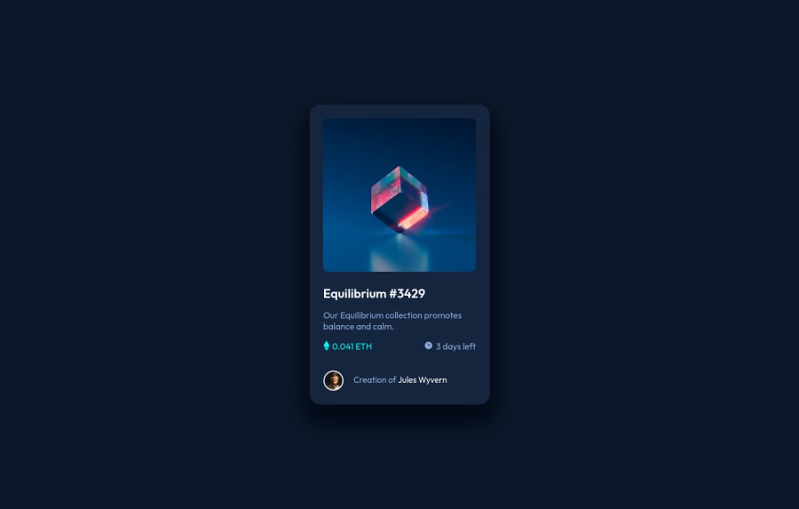
Design comparison
Solution retrospective
It took me some time to figure out how add the hovering effect to the image. I tried to play around a lil bit with it but I don't know if I took the best approach here.
Community feedback
- @Sdann26Posted over 2 years ago
Hi Natalia, the effects you have added and the layout is excellent, only the vertical centering is not a good idea to use margins. You could remove the margins from the card and add to the body instead
body {

    display: flex;
    flex-direction: column;
    justify-content: center;
    align-items: center;
    min-height: 100vh;

}
This will allow it to be centered on both vertical and horizontal axes.
Finally you have 5 accessibility issues in your frontend mentor report. You can eliminate all of them by changing
<div class="container">`` to<main class="container">`, since you should always have a main that contains the main flow of the project in this case is the NFT card.With these changes you can generate a new report and you will get 0 errors, if you have the same problems in the first challenge with the accessibility issue the same applies.
I hope my comments are helpful, good luck :D
Marked as helpful1@Natalia912Posted over 2 years ago@Sdann26 Hey! Thank you so much for the feedback, that was extremely helpful! I'll add all those changes now.
1
Please log in to post a comment
Log in with GitHubJoin our Discord community
Join thousands of Frontend Mentor community members taking the challenges, sharing resources, helping each other, and chatting about all things front-end!
Join our Discord
