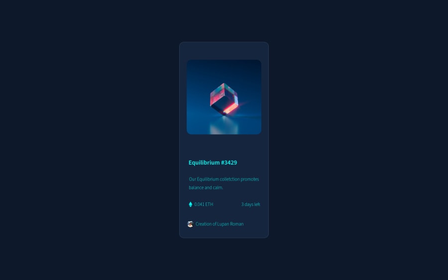
Design comparison
SolutionDesign
Community feedback
- @RioCantrePosted almost 3 years ago
Hello there! Good job in this challenge. Viewing the solution, I think you should consider the following as well…
- Instead of
div, alternatively wrap the whole content withmaintag . Use semantic tags, for HTML structures, refer it with this one Semantics - Wrap this line
<div class="main">withmaintag - Refactor this part with simple method, for instance...
<div class="main__text"> <h1>Equilibrium #3429</h1> <h2>Our Equilibrium colletction promotes</h2> <h3>balance and calm.</h3> <h4>0.041 ETH</h4> <p>3 days left</p> <img src="images/icon-ethereum.svg" alt="img" id="eth__svg"> <h5>Creation of Lupan Roman</h5> <img src="images/20180802_204432-01-modified.png" alt="png" id="profile__png"> </div> </div> Into: <section class="main__text"> <h1>Equilibrium #3429</h1> <p>Our Equilibrium colletction promotes balance and calm.</p> (can use padding or margin to adjust the size later on css) <div> <img src="images/icon-ethereum.svg" alt="img" id="eth__svg"> <span>0.041 ETH</span> </div> <div> <img src="" alt="img" id="clock"> <span>3 days left</span> </div> <div class="sample name here"> <p>Creation of <span>Lupan Roman</span></p> <img src="images/20180802_204432-01-modified.png" alt="png" id="profile__png"> </div> </section> CSS: .sample { border-top: 1px solid 'color value'; }- To understand more about the hero image hover state, refer it with this example Overlay in Image
Above all, Well done! Keep it going!
Marked as helpful1 - Instead of
Please log in to post a comment
Log in with GitHubJoin our Discord community
Join thousands of Frontend Mentor community members taking the challenges, sharing resources, helping each other, and chatting about all things front-end!
Join our Discord
