Design comparison
SolutionDesign
Solution retrospective
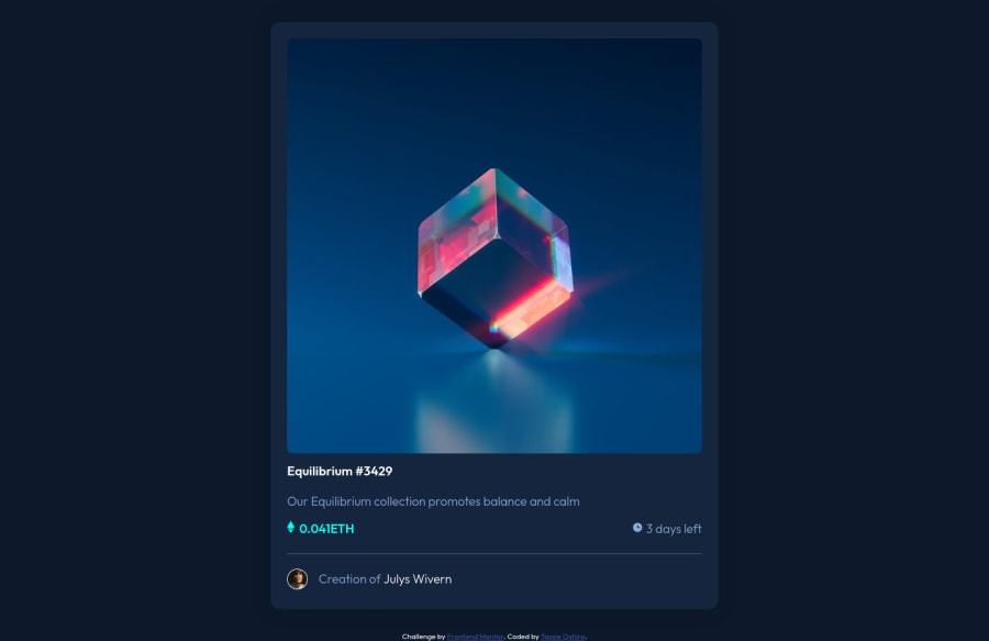
The first project done on my own, trying to get out of tutorial hell and it took so much time for a card component. Any feedback would be appreciated.
Community feedback
- @dewslysePosted almost 3 years ago
Hello @tassieoshiro. Massive congrats on completing your first solo project πͺ. Awesome job.
Some things to note:
- You could set a
max-width
on your.container
to prevent the card from growing unnecessarily big. This component has a max-width of375px
. - Your page is missing an
h1
. You could replace<h3>Equilibrium #3429</h3>
with<h1>Equilibrium #3429</h1>
All the best and happy coding.
1@tassieoshiroPosted almost 3 years ago@dewslyse thanks for the feedback ππΌππΌππΌ
1 - You could set a
Please log in to post a comment
Log in with GitHubJoin our Discord community
Join thousands of Frontend Mentor community members taking the challenges, sharing resources, helping each other, and chatting about all things front-end!
Join our Discord